

27.2.08
working ones arse off.
one has been doing.
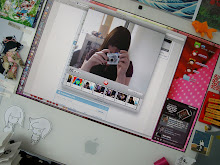
i've now got the work part of my site mostly done.
finding and resizing so many images makes my arm feel bad.
here's the jist of it.

yeah.
i've now got the work part of my site mostly done.
finding and resizing so many images makes my arm feel bad.
here's the jist of it.

yeah.
26.2.08

22.2.08
ideas:
but with a big giant paper mache sun head, stalking his old school friend.
he'll have a myspace, facebook and twitter page, all the tools of a good stalker. he'll add as many people as he possibly can. he'll upload his stalker photos and tag his stalk-eee in his photos. he'll update his twitter with his where abouts and his current thoughts.
gosh darn it, the sun want's friends and he's going to get them.
21.2.08
oh yeah, that project...
the solar century project has been in the background the past couple of weeks while i try to get my head around my website. but here's what i've been up to.
i've taken on the role of web designer at the moment, while ben comes up with a viral video that pops up when the solar panel is plugged into the usb port of the council's pooter. the idea being that we send out little bitty solar panels to coucils, to try to persuade them to use solar energy. they plug the little solar panel into their computer and a little viral video pops up, which then forwards you onto the website.
at the moment i'm not thinking about text and images too much, just figuring out where i want to put things.
at first i started drawing up my main idea - rollovers! i think that by using them cleverly it will be possible to create a really nice feeling of interaction. what i want to happen is for the little circles to get bigger as you roll over them, revealing information. i looked at some little circley ideas first.

then i drew up my first idea for the rollovers, a sun on top of an image of some nice grass, with little circle rollovers surrounding it.

as awesome as it would be to have a face covered in yellow face paint, staring out manically (the sun is manical), i decided that the idea may also be suitable for using the rollovers on top of a photo of a house, or a council building. not a kiddy-ish hand drawn one as shown below.

i tried to refine the idea down a bit more, trying to keep the fun feeling but make it less childish. this layout would probably look great as a flash site, but i'm sure i could figure it out with CSS as well. (the orange circles are going to be stills from the viral ad, with the centre of the sun having the lovely sun guy, maybe not his face, he can just pull a pose.)

this still felt a bit childish, so i also made a "boring as hell" layout, if we want to appeal more to the serious minded mindset of the councils. all nice and corporate and boring to design. but dammit the sun guy still gets in there!

CSS and that
although one has not been posting, one has been working.
one has been making pretty patterns:


look at me using small files!
and one has been working very hard on hand coding the CSS for the index page (resisting the temptation to be lazy in dreamweaver, i could make it all in five minutes if i wanted to but i don't want to i want to do it properly, dammit.), trying to make the layout as flexible as possible, so i can be as creative as i want to be with coming up with new layouts. thinking REALLY hard about what content i want to include and what it needs to look like to fit in with possible future layouts. thinking about what i want to do with my twitter feed, trying to get my head around flashr (me no likey actionscript), and screaming at the college computers when the links don't work properly or when browsers wont refresh my page properly, making me think my CSS is wrong.
i'm glad the site is finally starting to get past the conceptual stage, and is finally taking shape. there's still alot to be done but i feel like i'm getting somewhere now.
here's what the layout looks like so far:

i don't know where the little patterny idea came from really, i think it's my little obsession with origami paper. i've always like patterns i just never thought that i'd make them really. these are mostly based on my small collection of origami paper, simplified a lot.
mmm... pixels.
i've also been working on a little 3d kokeshi doll to hold a sign with my twitter feed inside it. or a thought bubble of something. i was originally going to try to make a pixel art one, but i've been missing maya recently so i thought that i'd give 3d a try.
here she is so far:

i'm going to doodle my ideas over this render later, then i can build her up some more.
and since i'm currently considering entering this competition it could come in handy.
6.2.08
nice web design hints

both of my following linkys are from pingmag a nice little tokyo based design site. here's five steps to CSS, if you're looking to refine and tidy up your CSS a bit (i am), and a nice little article about the website development process when you have to work with a client. it's so cyoooote.
pixely thoughts
reminiscing about the days i spent in MS paint with lovely pixels, and crappy water colour kids paint. and considering how to make a CSS layout based on banana sandwiches or marmalade.

hmm...
hmm...
5.2.08
interesting site:
the soulwax site.
for soulwax.

it presents the whole site on one page. you scroll across, find a section you like the look of and expand it and have a look. when you're done you fold it back and continue looking around. i like how it folds and expands, it treats the web page like a piece of paper.
mmm... iframes...
for soulwax.

it presents the whole site on one page. you scroll across, find a section you like the look of and expand it and have a look. when you're done you fold it back and continue looking around. i like how it folds and expands, it treats the web page like a piece of paper.
mmm... iframes...
flickr API
i'm thinking of playing with it.
i can't sign into flickr at college though.
that's annoying.
so this is more of a note to myself than anything else.
after looking into brendan dawes flickr tool scattr i found that someone has made a bit a code that lets you play with the flickr API inside flash, a certain program i'm trying to make myself like. this someone that made the code is called kevin luck, and you can find the code here. and there's a little tutorial here.
when get home must play.
4.2.08
wordpress
since several of the sites i'm quite fond of (like brendan dawes and joshua davis) use wordpress i decided to look into it. using a blog type thing would be a nice way of easily updating my site. but i'm concerned about how easy it will be to customise.
i've looked around on the forums and the wordpress site and installed it on my own site, so i can have a little play with it. but since all i'm really thinking of using it for is a news feed and possibly making some kind of commenting system on the work in my portfolio (which i'm not too fussed about), i'm not sure wether or not i will end up using it at this stage.
i could use it to create another blog on my site, but since i'm planning to re-design this one and i talk about my work on here i don't see much of a point.
i could do a bit of cheating with iframes, but that could mess up my plan to use that CSS swappy code.
i want to be able to design my site exactly how i want it, instead of re-working a template. there's blogger and myspace for that.
2.2.08
cup a soup is friend
ideas. here are some.

just looking at a couple of simple layout ideas, which went from stripes to compressing everything down and making it sprawl out.
also considering wether i want a boring plain text twitter feed or a nice fancy one. also need to look at different flickr feeds maybe.

i mocked up the stripy idea (me fav) in photoshop, so i can get a better idea of where i want to put things. the green bit is the news feed / blog, the blue bit is the space for twitter and flickr feeds, and the purple bit is where the layout changey buttons are going to be. at this stage i like serif fonts. i may not later on. i usually don't.
the next stage is going to be coming up with several ideas of colour palettes and images etc. and maybe a bit more layout tweaking.
that's it. i've done enough work today.
the soup. it burns.
i don't know what the hell just happened.
pretty ain't it? all innocent looking too. well, it's a LIE.

there i was, just innocently looking at the magnetic north website, minding my own buisness, marvelling at how scrolling reveals patterns on the page and the nice light box page layout style used which reminds me of oh so happy times hiding in darkrooms, when i started clicking around.
than all hell broke loose.
it's nice in a "what the hell is going on what is that oh did i break it" kind of way.
it uses all kinds of flash trickery beyond my knowledge or understanding, you click the flowery buttons and everything turns and spins and then more buttons appear or little graphics or pencils or giant mouse cursors, with weird talking and clunking going on in the background.


it made me go "squeee". i like how there is all this mayhem underlying the nice presentable site, and how it's all unleashed with an unknowing click.
choco leibniz
= freakin' awesome.
i've lost the ability to speak, everything keeps going whoooshy and my throat insists on causing me great pain (which is extremely unfair as i don't even have tonsils... i haven't had them since i was nine and only now is it starting to freak me out a little) but i have orange lucozade on tap and gosh darn it i'm going to do some work today.
not much probably, but some will do.
i've had a little idea... my main problem with designing a site that i'm happy with is that i tend to get bored of the design while i'm making it, or just about when i've finished it. but i've discovered a little CSS trick which lets you use several possible CSS templates on one page... i've seen it on a little webcomic i read called little gamers. if you look in the linky section there's a set of buttons which allow the user to pick from several templates. they've only used it to change the background of the site but i think it's really rather clever and could be put to more use.
i also read how to do it in these nice new shiny books i got.

YAY BOOKS.
this means i can set up the basic site, with the pages and files where i want them, and then when i get bored of a layout i can just add a new one. a the moment i'm just thinking of a simple idea where you can invert the colours on the page by choosing a different layout.
Subscribe to:
Posts (Atom)