30.3.08

i like blossom.


working, working, working, working.

probs for teh website.

25.3.08

fio is on her hols.

one has been playing far too much guitar hero, mario galaxy and FF7.
i have access to so many games and consoles here, it's GOOD.
the internet is a bit pap though.

I've started working on the second CSS sheet for my site, as well as trying to find out how to set up my own web cam feed. i can't seem to find much really useful information about setting up a web cam feed, i've downloaded several programs but have no idea how to get the feed onto my site. more research needed methinks.

here is what it looks like so far:


needs ALOT more work, just hoping that my CSS swappy code works fine in the end. need to think of more patterns to use. at first i was going to go with something a bit floral, inspired by this pretty tree in the backgarden, but decided to go with pink cubes of doom.


not much is different from the original CSS sheet really, still need to work on the fonts and links.

i've also been reading this REALLY big book.


for my final major project i want to do something with processing, at the moment i'm still trying to find out what's possible (it's seems that almost anything is really). i'm just hoping i'm not biting off more than i can chew.

11.3.08

workage.

here's what the home page now looks like:

i've decided to go with a 2d illustrator kokeshi instead of a 3D one, mainly to save on time. i've also decided to make a different kokeshi for each different CSS layout, as well as changing the site logo, background, and any other elements that i can faff around with. there's also going to be a sad robot next to my flickr feed, but i've yet to make him.

and here are the info and play sections of the site:


same basic CSS, just different backgrounds. the info section is going to hold a lot more than it currently does, still thinking about what i'm going to put in there. and the play section is basically going to be a list with some small thumbnails of random things i've made for the heck of it, and as it says, there's nothing to put up there just yet.

6.3.08

solar boys virtual diggs


here's the man himself outside his virtual house, which has yet to be equipped with solar panel malarky.
i'm not that happy with it to be honest, i'm not accustomed to building normal looking houses in second life so find it rather strange... i think it needs a lot more work but at least it looks like a house.


fio kaminski's building it though.
it wont be floating in the middle of nowhere when it's done, just need to terraform a plot first.

orange cow.

you read right.

yeah, he's cool.

this little orange cow named Winny was designed by Kuntzel and Deygas, and features in a little film by them, in which Winny tours Tokyo.


he visits a variety of places, including a japanese spa and fish markets, but there's not that much interaction between him and the world around him. he mostly tends to look bemused at the world around him, but poses at the same time.


there's also some cartoon inserts dotted throughout the film which show which part of Tokyo he's in.


there's also some very subtle effects with Winny, while his facial expression is restricted to the mask he's wearing, through some post editing and dabbling his eyes move, it's quite subtle but very effective.


Me and Ben watched the film before we filmed solarboys adventures, hoping to get a similar effect, but with a lot more interaction with the world and people around. We would like to make solarboys eyes move with some editing, but at the moment i'm not sure we're going to have the time for it!

filming and mock ups and that

finally, he was ready.

look at him in all his glory!

we then went out filming. we now have lots of hilarious footage of elf playing as sun boy, being ignored and embraced by the people of hyde park.
we thought he would mostly be ignored, but people seemed to warm to him... a bit too much. so we had to deploy a "please ignore, thanks!!!" sign. here he is wanting to go on the bus.


and here is the mostly-final-i-can't-see-much-wrong-with-it mock up of what the site is going to look like.
i'm getting used to illustrator now, methinks.


and here is his myspace page:
solarboy LOVES YOU!

4.3.08

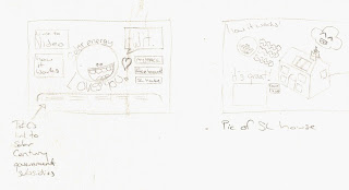
final-ish ideas and mock up

sketchlings:

scribble scribble scribble.
thinking more in a simple vector-ish style, with a better idea of where i want to put things.

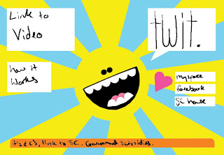
and here's the mock up:

one has been spending quite some time pratting about in illustrator, but needs to learn to tidy up her pen-age.
it's quite twitterish.

needs work...


transition from low res to high res screen is enlightening.

still, chirpy.