

the perverts guide to cinema
with all those pennies you'll be getting from santa.
21.12.06
20.12.06
meep

there's now a bigger and better haired version of me on second life.
i envy her hair. and that top.
i be calleth fio kaminski. add me.
12.12.06
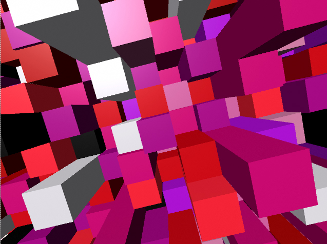
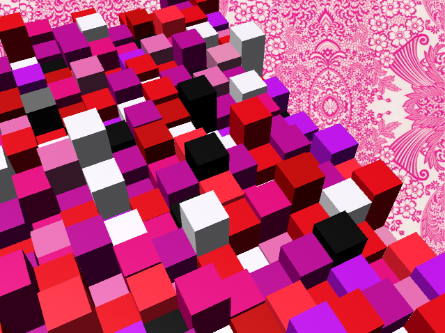
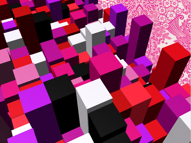
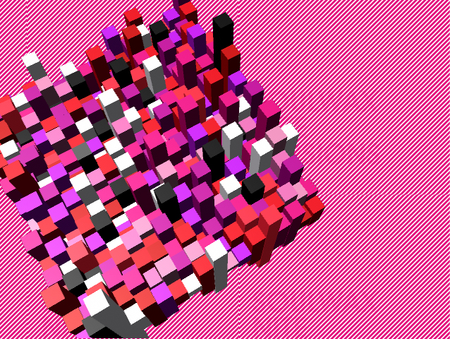
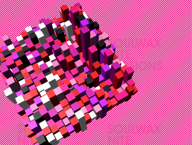
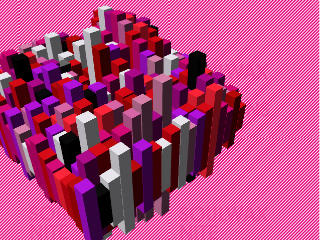
Aniamtion evaluation (hehe that ryhmes)
I’m really happy with my animation, it’s the first proper animation I’ve ever done, and the first time I’ve used maya, so I’m quite proud I’ve managed to get something that works, let alone works this well. I think some of the synchronization is off in the first six seconds, but I think I’ve managed to synchronize the rest quite well. I think my decision to abandon some of my ideas and not include the “whooshy floower” or army of marching toys was right, the cubie thing is enough to hold the viewers attention, it’s an interesting object in itself, there was no need to add anything else to the animation.
I don’t think I planned my time effectively, I ended up only spending three weeks on the final piece, the rest of the term was spent learning the programs and doing research. I found it difficult to storyboard ideas when I was unsure of what I would be able to do with the programs. I was sure I wanted to do something in maya as 3d interests me so much, but I was tempted to do something in flash as I have previous experience in using the program. I’ve ended up using both maya and flash, which I think was effective. It would have taken me weeks to animate each individual cube to the music in maya, where as in flash I was able to use the frames exported from maya of the cubes moving, and then synchronize it to the music in flash. I would have liked to have done it all in maya, it would have been nice to experiment more with the movement of the cubes, but I think it still works well.
If I was going to do this project again, I would like to give myself more time to actually make my final piece and experiment in maya some more, I feel most of my experimentation was done whilst making the final piece, which was a bit frustrating as I had to concentrate on getting the thing done instead of really pushing it further.
7.12.06
when i close my eyes all i see is pink cubes - animation


IT'S DONE.
my arm is about to fall off, but it's done.
YES.
i'll post the video when youtube stops being so silly.
6.12.06
critical studies notebook - links + bibliography
image analysis exercise
picture essay
critical review of Barthes Mythologies
thomas ruff portraits review
constructivism definition
other critical blog enteries:
oh my gosh i love tate modern
i've been reading...
semiotics
bibliography:
Picture essay - Sean Topham, 2003, "Where's My Space Age?", Prestel
critical review of Barthes Mythologies - Roland Barthes, 1957, "Mythologies", Vintage
Thomas Ruff portraits review - Tate Modern, 2006, "UBS Openings: Photography From The UBS Art Collection" leaflet, Tate
- Thomas Ruff interview, last acsessed - 6/12/06
- tate magazine, last acsessed 6/12/06
constructivism definition - wikipedia entry, last acsessed 6/12/06
oh my gosh i love tate modern - johnny hardstaff podcast, last acsessed 6/12/06
i've been reading - Terence Hawkes, 1977, "Structuralism and Semiotics", New Accents
semiotics - Roland Barthes, 1957, "Mythologies", Vintage
- Terence Hawkes, 1977, "Structuralism and Semiotics", New Accents
thomas ruff - critical studies
Thomas Ruff believes that photographs can only show the surface of things. Photographs don’t explain anything to you, tell you of the subjects history or tell you what happened the moment before or after the photograph was taken. All photographs can do is show the skin of a reality that goes much deeper.
Nowhere is this idea more apparent than in his series “Portraits”, part of tate modern’s “UBS Openings: Photography From The UBS Art Collection” exhibition. These photographs taken by Ruff of his friends and family give no details of the subject’s life. Each photograph resembles a passport ID photo blown up to larger than real life size, each face expressionless, void of personality. The odd glimpse of individuality is lost within the rows of anonymous faces, the effect of which is disorientating. Your eye desperately searching for something that will tell you anything about these people’s lives, something that will allow you to build a story, offering these uknown faces a place in space and time. But there’s no such relief, just a growing sense of unease as you wonder why these people look at you with an air of distaste, like something they scraped off the bottom of their shoe.
Ruff studied photography under the Bechers in the late 1970’s, renouned for their style of detachment and use of only black and white photography. But Ruff soon decided to use colour in the Portraits series which he started in 1981, still studying at the Düsseldorf academy, stating that “colour is close to reality. The eye sees in colour.” And that “Black and white is too abstact for me”, challenging the traditional black and white documentary tradition of photography.
Ruff’s portraits are a reaction to the “terrorismushysterie”, the secret service that observed people opposed to nuclear power, and the “berufsverbot”, where left-wing teachers were dismissed in the 1970’s. Which he uses to explain why these faces are so expressionless, “why should my portraits be communicative at a time when you could be prosecuted for your sympathies?”
These pictures question photography’s ability to show what’s real, the semblance to reality is apparent. Ruff says “photography pretends”, it only touches the surface of things, unable to go any deeper it pretends to show a mirror image of reality.
5.12.06
constructivism - critical studies
Constructivism is an art movement that was founded by Vladimir Tatlin in 1913 in Russia. Constructivists believed that art could be used for social purposes and the development of a socialist state. Heavily influenced by industrial design and technology, constructivist art often had political messages, affected by the revolution.
Barthes was a plastic fetishist - critical studies
Mythologies – Roland Bathes 1957
One of the myths explored in Barthes Mythologies is the ‘myth’ of plastic. In this section of the book Barthes explores the effect of this relatively new material on people’s perceptions natural materials, and ‘imitation materials’:
“Until now imitation materials have always indicated pretension, they belonged to the world of apperances, not to that of actual use; they aimed at reproducing cheaply the rarest substances… all the luxurious brilliance of the world. Plastic has climbed down, it is a household material.” - (Barthes, Mythologies, 1957, pg 98)
all at once able to become buckets aswell as jewels, plastic allowed itself to be swallowed up in the process of making the final product, where as natural materials cling on to their former qualities. Barthes describes the process of using plastic to make dressing room tidies as “the magical operation par excellence: the transmutation of matter” liking the the machines attendant to a “half-god, half robot” capable of performing this alchemy but appearing braindead, unaware of this miracle.
Barthes seems to celebrate plastics qualities, it’s ability to become almost anything, “plastic is the very idea of it’s infinite transformation”, realizing that this new substance means that objects will be created simply for the pleasure of using them, this new material making imaginable the “invention of forms”.
But at the same time he describes it as a non-object “powerless to achieve the smoothness of nature”:
“a disgraced material, lost between the effusiveness of rubber and the flat hardness of metal; it embodies none of the genuine produce of the mineral world” - (Barthes, Mythologies, 1957, pg 98)
The idea of plastic being a non-object seems to me to be a striking idea. The majority of the world seems to be made of plastic, we’re living in a world populated with non-objects. These items that have no tactile quality, you barely notice them when you hold them.
4.12.06
comm des research (or lets make my presentation easier if i can use a projector)
masters of photography
This is the website i mostly got my idea from. It contains loads of information but the design isn't brilliant, it's very simple and uses tables for its text based layout, and it's absolutley full of pop ups and google ads, which makes it very frustrating to use, even with a popup blocker. They tried to do something with the font for headers, and the graphics used aren't great but they are kind of relevant to the subject, but the layout lets it down. there's the oppurtunity to do alot more with the design, i think.
The layout of the navigation is a bit confusing, each photographer has their own section, which contains links to articles, photographs and resources.
profotos
This is the 'masters' section of a website that's a photography community. In other sections photographers can post links to their websites and get feedback, which i think is a great idea. But the design of this website really confuses me! what the hell i going on with the man in an anorak? with that massive lens he looks like a pervert. There's a rock face in the background aswell, i don't think the images used really convey what this website is about, it's meant to be a photographic resource and community but it looks like a website for anorak wearing, clock climbing, telephoto lens abusing old men.
fox talbot museum
This website is so terrible i had to include it. Everything wrong with the internet is symbolised by this page. Well, almost.
but there are some nice websites out there...
nicephore-niepce
French website by the Paris photo school about the inventor of photography. The index page uses a very image based design, with and 'olde worlde' font, which gives the website a very historical feel. The main website uses frames to make a layout which allows for a lot of information and text to be contained on the pages. I think this is a good website because it has a sense of identity, it knows the message it wants to get across to it's audience.
also, when i say the web site name it souds like "nice for niepce" which i think is nice.
Jerry Uelsmann
there is hope!
and it comes in the form of the official website for the photographer Jerry Uelsmann, who's great.
It's a flash based website, which uses simple graphics in a very effective way. Makes me go "OOOOH", and makes the navigation enjoyable to use. Large amounts of text are in scroll boxes which leaves more space for lots of images, I think a similar layout could easily be produced with div layers. I like this website because it feels like you're interacting with it, not just using it. And it has lots of interesting stuff on there.
3.12.06
brainstorming / first scrawls resembling an idea - comm des
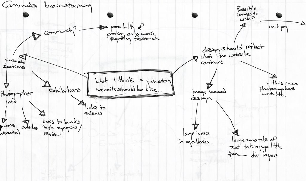
^ what i think a photography website should be like
brainstorming possible sections, what i want some of the pages to contain, what i want the design to be like.
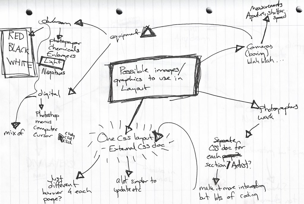
^ possible images / graphics to use in layout
trying to get past the obvious use of images, managed to come up with a possible colour scheme and the definate exclusion of men in anoraks (profotos)

^ things i want to avoid
tables, rows and rows of text, confusing navigation, anoraks, dark dingy design.

^ first scrawl resembling a decent idea
using div layers and if i can figure it out an external CSS document for layout and colour scheme (which i think is going to be white, red and black... inspired by darkroom colours. i don't care if the darkroom at LCAD is amber, they're supposed to be red!) trying to figure out where i'm going to place images and text, blah blah blah.
An interesting idea that i've come up with is to have three different ways of finding the photographer you want to look at, you could look through them by name, thumbnail (a nice little crop of one of their photos maybe) and movement, but not sure if i'll be able to do the last one with my limited knowledge of the history of photography.


Subscribe to:
Posts (Atom)