just incase anyone was interested in what i said, because i said it all really quickly and couldn't explain anything well as it was morning and i was very aware of how geeky i am.
Semiotics“Human culture is made up of signs, each of which stands for something other than itself, and the people inhabiting culture busy themselves making sense of those signs.” - (Mieke Bal and Norman Bryson, Visual Methodologies)
Semiotics was first established by the Swiss linguist and structuralist Ferdinand de Sassure. Semitotics is part of structuralism, which attempts to explain language as a structure. That parts of the language (such as words) abide by it’s rules (grammar, spelling etc), and outside of the system of language, the parts and rules are meaningless.
StructuralismThe world does not consist of independently existing objects, the method of perception affects how the object is perceived.
Objective perception is not possible, as the observer “creates” something of what they observe.
So the only thing that can be observed is the relationship between between the observed and observer.
“It becomes the stuff of reality itself… In consequence the true nature of things may be said not to lie in things themselves, but in the relationships which we construct, and then percieve between them.” - (Terence Hawkes, Structuralism and Semiotics)
A structure (such as language) is self regulating, and it’s parts (words or signs) have no meaning unless they are integrated into the structure.
No reality exists outside of the reality created by the language itself, “In the end, it constitutes it’s own reality”
Our own reality is based on the structure of the language in the society in which we live. No two languages share the same “social reality”.
Language is more than a problem solver for communication, the “real world” is built upon the language habits of the group.
Language exists outside of history and reality, it creates it’s own.
Parole and LangueLangue - the whole language and all of it’s rules (grammar, spelling etc) and it’s components or parts (words)
Parole - the individuals use of language, (speech) which causes a language to evolve
If you’re going to have a conversation, you have to abide by the rules of language so what you’re saying is understandable, but language is capable of transforming itself due to new combinations of it’s components, which happens in the event of speech.
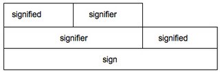
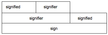
signified and signifier
“The signified is the concept, the signifier is the acoustic image (which is mental) and the relation between concept and image is the sign (the word for instance), which is a concrete entity.” - (Roland Barthes, Mythologies)
Or…
“A sign is always thing plus meaning” - (Williamson, Visual methodologies)
other terminologyIcon - signifier represents signified by apparently having a likeness to it
Index - inherent relationships between signified and signifier
Symbol - conventional but clearly arbitrary relation between signified and signifier (babies representing future etc.)
Objective correlates - certain objects become taken for granted as having certain properties
Mortise - image of the product framed in some way
Mythology and Semiotics“The ideas of the ruling class are in every age the ruling ideas.. In order to sustain these structures the dominant groups attempt to represent the world in forms that reflect their own interests, the interests of their power.” - (Marx and Engles / Hodge and Kress - Visual Methodologies)
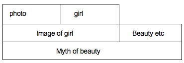
Roland Barthes published ‘Mythologies’ in 1957, the book is a collection of essays which examine the myths present in French culture. It also describes the concept of myth as a “Second order semiological system”, adding to the following diagram shown earlier.
As we can see, the sign taken from the first semiological system is transformed into a signifier in the generation of the myth. Language itself has been reduced to signifier. The meaning generated by the original signifier and signified is hidden by the new meaning.

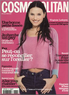

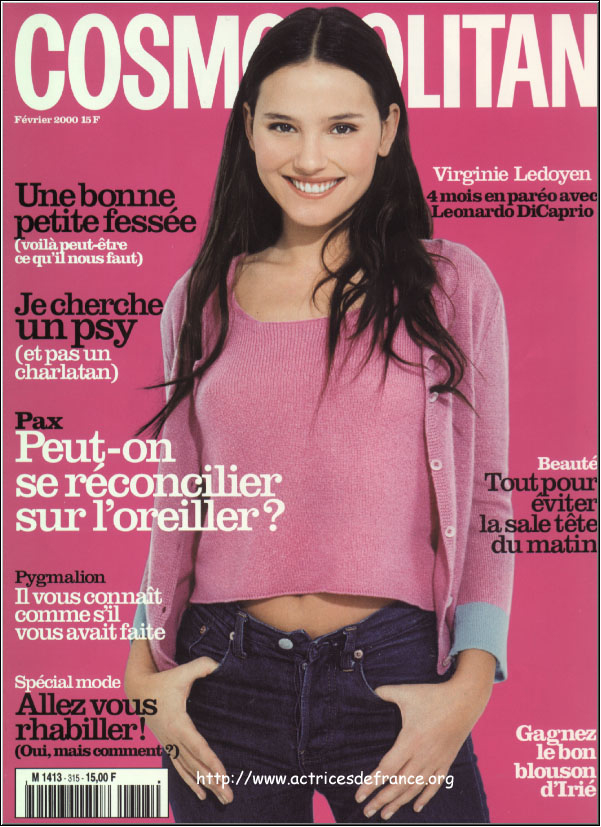
All of these images have used myth to create new meaning.
The original meaning, has been hidden behind the myth of beauty and happiness. These characters seem enviable, happy, beyond conflict and unique.
The actual reality or history of the model and the situation is abandoned or ignored (she could have been the smelly, spotty girl who was unhappy and hated, happiness could be an illusion, we have no idea what’s happening outside of the frame, they could have been photoshopped), all that remains is her likeness which has been transformed into a myth.
But the old meaning still remains, hidden under the surface, which helps make the myth credible.

“Myth hides nothing: it’s function is to distort, not to make disappear.” - (Barthes, Mythologies)


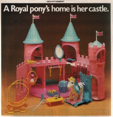
You’ve probably noticed that these are “My little ponies”, these are cropped images taken from adverts, I’ll show the full ones in a minute.
Any guesses what they’re doing?

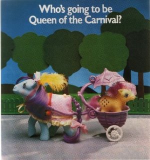
The text works as anchorage, telling the viewer what is supposed to be going on in these strange situations that have no resemblance to reality. Horses don’t live in pink castles and ride around in prams etc.
There also seems to be a recurring theme of royalty, which is probably supposed to convince little girls they need expensive things to be worthwhile.

“Faced with this world of faithful and complicated objects, the child can only identify himself as owner, as user, never as creator; he does not invent the world, he uses it… he is turned into a little stay-at-home householder who does not even have to invent the mainsprings of adult causality; they are supplied to him ready made: he is never allowed to discover anything from start to finish.” - (Barthes, Mythologies)
“Myth has in fact a double function: it points out and it notifies, it makes us understand something and it imposes it on us.” - (Barthes, Mythologies)
“Yet, because ads are so pervasive and our reading of them so routine, we tend to take for granted the deep social assumptions embedded in advertisements: we do not ordinarily recognize them as a sphere of ideology.” - (Goldman, Visual Methodologies)
“Ideology is the meaning made necessary by the conditions of society while helping to perpetuate those conditions. We feel a need to belong, to have a social ‘place’; it can be hard to find. Instead we may be given an imaginary one.” - (Williamson, Visual Methodolgies)


 no C no K
 Kontakschmelze (contact fusion)
 grantz graf - autechre
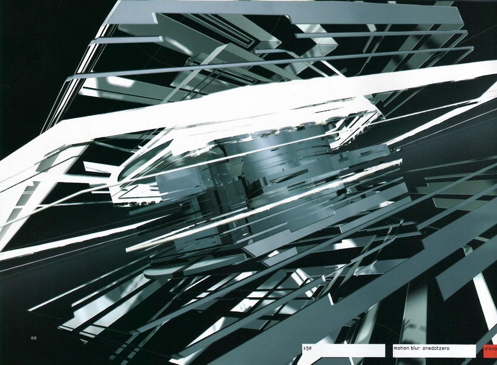 (yes, i'm still going on about it)
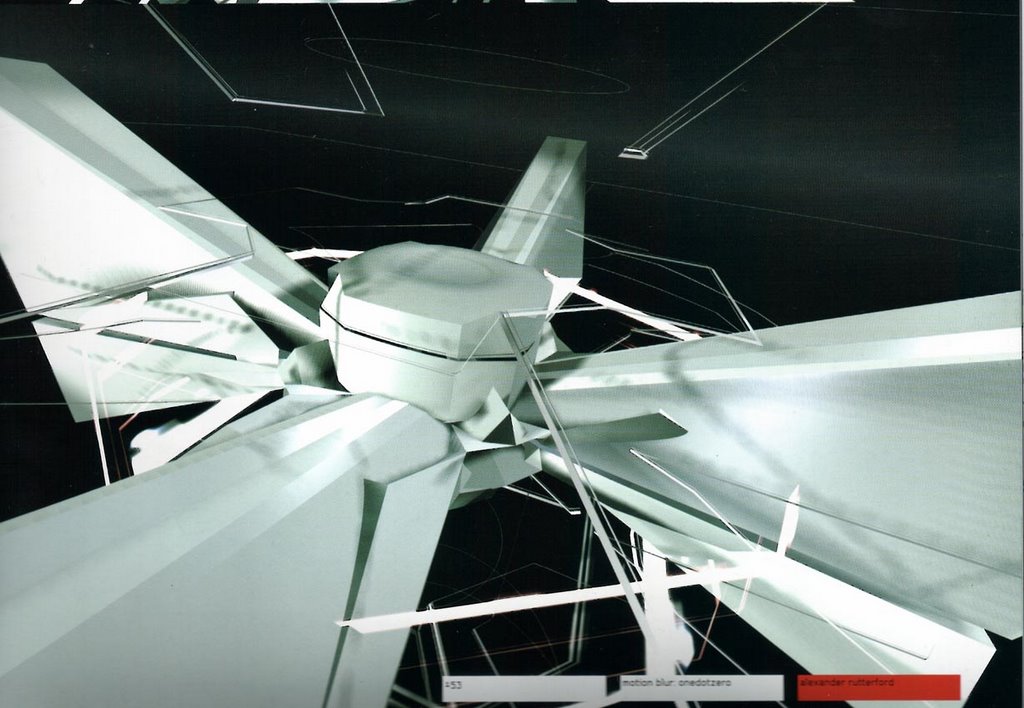
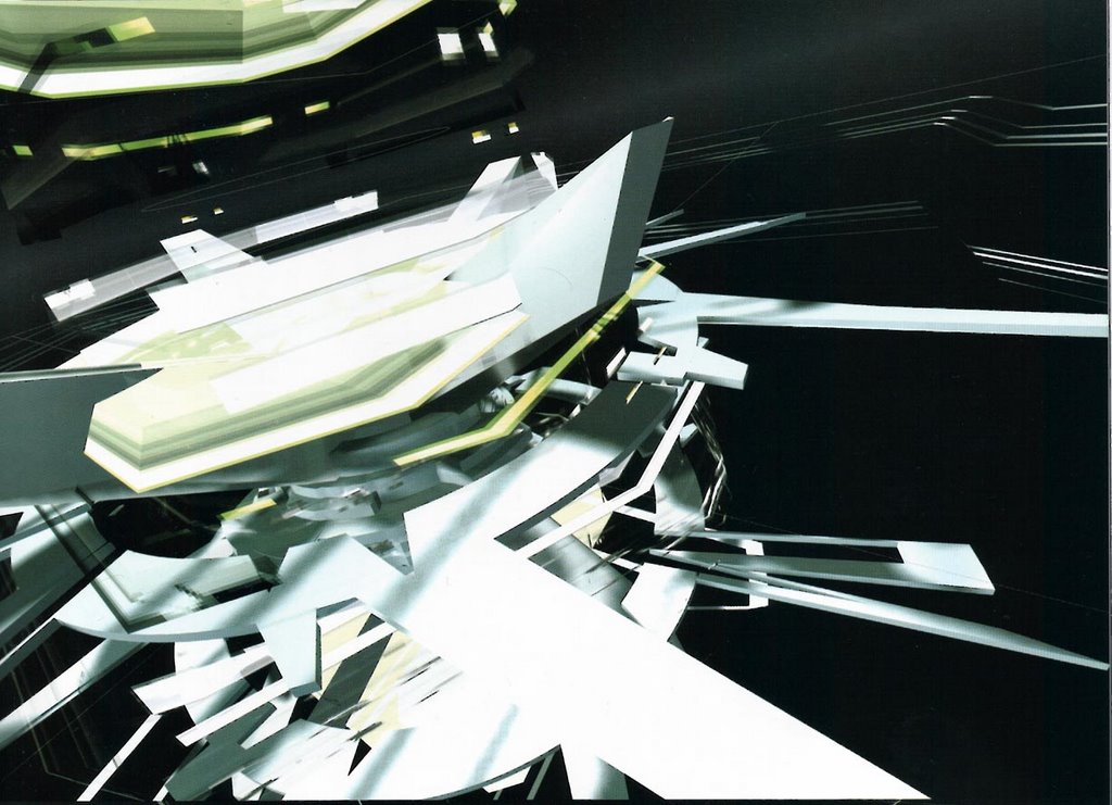
 3space
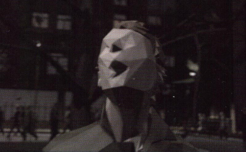
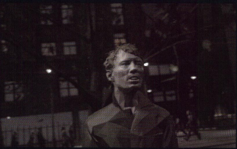
 go to sleep - radiohead