
 Posts
Posts


masters of photography
This is the website i mostly got my idea from. It contains loads of information but the design isn't brilliant, it's very simple and uses tables for its text based layout, and it's absolutley full of pop ups and google ads, which makes it very frustrating to use, even with a popup blocker. They tried to do something with the font for headers, and the graphics used aren't great but they are kind of relevant to the subject, but the layout lets it down. there's the oppurtunity to do alot more with the design, i think.
The layout of the navigation is a bit confusing, each photographer has their own section, which contains links to articles, photographs and resources.
profotos
This is the 'masters' section of a website that's a photography community. In other sections photographers can post links to their websites and get feedback, which i think is a great idea. But the design of this website really confuses me! what the hell i going on with the man in an anorak? with that massive lens he looks like a pervert. There's a rock face in the background aswell, i don't think the images used really convey what this website is about, it's meant to be a photographic resource and community but it looks like a website for anorak wearing, clock climbing, telephoto lens abusing old men.
fox talbot museum
This website is so terrible i had to include it. Everything wrong with the internet is symbolised by this page. Well, almost.
but there are some nice websites out there...
nicephore-niepce
French website by the Paris photo school about the inventor of photography. The index page uses a very image based design, with and 'olde worlde' font, which gives the website a very historical feel. The main website uses frames to make a layout which allows for a lot of information and text to be contained on the pages. I think this is a good website because it has a sense of identity, it knows the message it wants to get across to it's audience.
also, when i say the web site name it souds like "nice for niepce" which i think is nice.
Jerry Uelsmann
there is hope!
and it comes in the form of the official website for the photographer Jerry Uelsmann, who's great.
It's a flash based website, which uses simple graphics in a very effective way. Makes me go "OOOOH", and makes the navigation enjoyable to use. Large amounts of text are in scroll boxes which leaves more space for lots of images, I think a similar layout could easily be produced with div layers. I like this website because it feels like you're interacting with it, not just using it. And it has lots of interesting stuff on there.
Showing posts with label Personal Site. Show all posts
Showing posts with label Personal Site. Show all posts
4.12.06


3.12.06
brainstorming / first scrawls resembling an idea - comm des
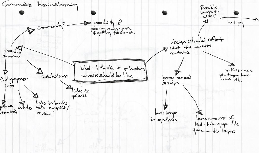
^ what i think a photography website should be like
brainstorming possible sections, what i want some of the pages to contain, what i want the design to be like.
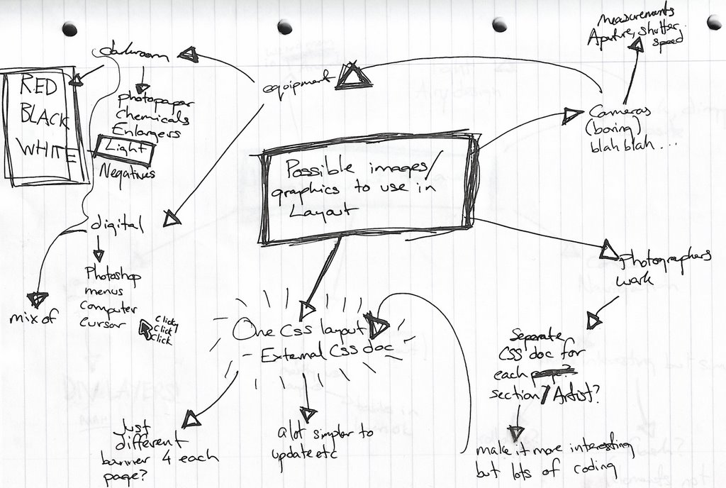
^ possible images / graphics to use in layout
trying to get past the obvious use of images, managed to come up with a possible colour scheme and the definate exclusion of men in anoraks (profotos)

^ things i want to avoid
tables, rows and rows of text, confusing navigation, anoraks, dark dingy design.

^ first scrawl resembling a decent idea
using div layers and if i can figure it out an external CSS document for layout and colour scheme (which i think is going to be white, red and black... inspired by darkroom colours. i don't care if the darkroom at LCAD is amber, they're supposed to be red!) trying to figure out where i'm going to place images and text, blah blah blah.
An interesting idea that i've come up with is to have three different ways of finding the photographer you want to look at, you could look through them by name, thumbnail (a nice little crop of one of their photos maybe) and movement, but not sure if i'll be able to do the last one with my limited knowledge of the history of photography.
26.11.06
comm design rationale (i wanna make a website because they're good)
Although I enjoyed working on my montage and working with print, I want to develop my web making skills further, so I have decided to make a website.
I first thought of possibly making a website to promote a film or book, but after some thought I have decided to make a photography website or resource for students. This way I am working with a subject that interests me, and attempting to fill what I think is a gap in what is avaidable on the internet. I have used the websites avaidable (that I was able to find), and most whilst containing useful information were poorly designed, difficult to navigate and full of google ads and pop ups.
I want to make a well designed website that is easy to navigate and use, which contains a lot of information but still uses graphics and images to make it into more of an visual experience.
The target audience of my website will mainly be students (photography, possibly multimedia / graphic design / fine art students), and possibly teachers and lecturers aswell.
I want to survey a group of people from my target audience to find out what information they look for and want on a photography website, but possible sections could be equipment, history of photography, recommended books, and information on upcoming exhibitions. I want to make the information on the website relevant to what my target audience want, so I’ll be asking them about their favourite photographers, cameras, websites and also their other interests, so I can get an idea of what kind of design would be suited to my target audience.
I think web design is best suited for this idea as it can keep up to date with new events easily, can easily contain a lot of information and can utilise multimedia to make slideshows of photographers work or something.
I first thought of possibly making a website to promote a film or book, but after some thought I have decided to make a photography website or resource for students. This way I am working with a subject that interests me, and attempting to fill what I think is a gap in what is avaidable on the internet. I have used the websites avaidable (that I was able to find), and most whilst containing useful information were poorly designed, difficult to navigate and full of google ads and pop ups.
I want to make a well designed website that is easy to navigate and use, which contains a lot of information but still uses graphics and images to make it into more of an visual experience.
The target audience of my website will mainly be students (photography, possibly multimedia / graphic design / fine art students), and possibly teachers and lecturers aswell.
I want to survey a group of people from my target audience to find out what information they look for and want on a photography website, but possible sections could be equipment, history of photography, recommended books, and information on upcoming exhibitions. I want to make the information on the website relevant to what my target audience want, so I’ll be asking them about their favourite photographers, cameras, websites and also their other interests, so I can get an idea of what kind of design would be suited to my target audience.
I think web design is best suited for this idea as it can keep up to date with new events easily, can easily contain a lot of information and can utilise multimedia to make slideshows of photographers work or something.
23.11.06
website online
my website is now online! and without nasty adverts, and all for $7.
at the moment it's just the one i made last week for the brief, hopefully i'll be able to find time to make it into a lovely fully fledged dynamic wonderful full of information and images phwoarsome entity.
college work, slobbing, sleep, reading, eating, housework and nap times permitting.
click me
at the moment it's just the one i made last week for the brief, hopefully i'll be able to find time to make it into a lovely fully fledged dynamic wonderful full of information and images phwoarsome entity.
college work, slobbing, sleep, reading, eating, housework and nap times permitting.
click me
the rage... the anger...
the horrible feeling of seeing my lovely website being raped by google ads.
DAMN YOU GODADDY! YOU ARE POO.
anyway, since i managed to figure out how to setup ftp, only to see something that burned my retinas, for now all you're going to be seeing of my lovely website (it really is lovely) are these screen grabs. sorry.
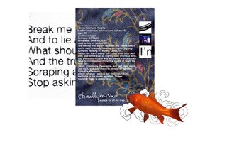
index (FISHIE!!)

music (needs more work methinks)

photography (oooh.. pink)
i'm pretty happy with the design, i got to develop on my existing skills and learnt how to tidy my code up abit. I went for quite an image heavy design, aiming at people with broadband connections and nice wide screens. i tested it out on my imac at home as well which has a smaller screen than these lovely G5s and there weren't any problems, i didn't have to do much extra scrolling as i tried to keep my design quite centered and screensize-ish, using the overflow tag on any layers with lots of information in them. I think that if you don't have broadband in this day and age you're being a bit silly, and don't deserve to see all the lovely photos and graphics i put so much effort into without a wait.
i would to do a bit more work on the music page, there isn't much content there really, i would like to add a little flash music player or something, or maybe video.
DAMN YOU GODADDY! YOU ARE POO.
anyway, since i managed to figure out how to setup ftp, only to see something that burned my retinas, for now all you're going to be seeing of my lovely website (it really is lovely) are these screen grabs. sorry.

index (FISHIE!!)

music (needs more work methinks)

photography (oooh.. pink)
i'm pretty happy with the design, i got to develop on my existing skills and learnt how to tidy my code up abit. I went for quite an image heavy design, aiming at people with broadband connections and nice wide screens. i tested it out on my imac at home as well which has a smaller screen than these lovely G5s and there weren't any problems, i didn't have to do much extra scrolling as i tried to keep my design quite centered and screensize-ish, using the overflow tag on any layers with lots of information in them. I think that if you don't have broadband in this day and age you're being a bit silly, and don't deserve to see all the lovely photos and graphics i put so much effort into without a wait.
i would to do a bit more work on the music page, there isn't much content there really, i would like to add a little flash music player or something, or maybe video.
5.11.06
i've been reading...
"structuralism and semiotics" by Terance Hawkes. It's about structuralism and semiotics. I'm reading it so i can get a better understanding of semiotics and understand what Roland Barthes is going on about in "Mythologies", which i've also started reading. I found this quote which seems applicable to the effect of digital media on communication even though it discusses written forms of communication (books and "administrative machinery").
"...In this respect it is, rather than modern societies that should be defined in negative terms. Our relations with one another are now only occasionally and fragmentarily based upon global experience, the concrete 'apprehension' of one person by another. They are largely the result of a process of indirect reconstruction, through written documents. We are no longer linked to our past by an oral tradition which implies direct contact with others (storytellers, priests, wise men, or elders), but by books ammassed in libaries, books from which we endeavour - with extreme difficulty - to form a picture of their authors. And we communicate with the immense majority of our contemparies by all kinds of intermediaries - written documents or administrative machinery - which undoubtedly vastly extend our contacts but at the same time make those contact somewhat 'unauthentic'.
...We would like to avoid describing negatively the tremendous revolution brought about by the invention of writing, while it confered vast benifits on humanity, did in fact deprive it of something fundamental." - (Claude Levi-Strauss, 1972)
It's all so interesting. (btw i'm a geek)
"...In this respect it is, rather than modern societies that should be defined in negative terms. Our relations with one another are now only occasionally and fragmentarily based upon global experience, the concrete 'apprehension' of one person by another. They are largely the result of a process of indirect reconstruction, through written documents. We are no longer linked to our past by an oral tradition which implies direct contact with others (storytellers, priests, wise men, or elders), but by books ammassed in libaries, books from which we endeavour - with extreme difficulty - to form a picture of their authors. And we communicate with the immense majority of our contemparies by all kinds of intermediaries - written documents or administrative machinery - which undoubtedly vastly extend our contacts but at the same time make those contact somewhat 'unauthentic'.
...We would like to avoid describing negatively the tremendous revolution brought about by the invention of writing, while it confered vast benifits on humanity, did in fact deprive it of something fundamental." - (Claude Levi-Strauss, 1972)
It's all so interesting. (btw i'm a geek)
4.11.06
site map idea - comm design

here's a couple of diagrams of how i think i'm going to do my website. It's going to have five pages. i want each page to have it's own layout, maybe the same standard layout for each page but with different colours and elements / illustrations.
Index / home - links, photos of me, "stuff", ramblings, flashy things (like floria sigismondi?)
Films i like to look at - layout idea - drawings from stills of characters from films etc
- 2001, house of flying daggers, requiem for a dream, the meaning of life
Photography - layout idea - mix of photograms and doodlings (like bjork vespertine artwork)
- my work.
- "mechanical eye" - i want to get this idea across
musics i like to listen to - layout idea - not sure yet, want to include piccies and vids from gigs i've been to and fav lyrics
- muse, radiohead, garbage, bjork, placebo, soulwax, tom waits?
books i do love - layout idea - photos of books and doodlings
- list of fav books
- reviews?
- quotes
i don't want the pages to be too different from the others, i want some elements to cross over the sections. i like the idea of combining photographics elements with illustrations, i think if i do this on all of the pages it will bring it all together.
i think this idea has been heavily influenced by one of my favourite (mini) websites, bjork's greatest hits website (here). each page (one for each song on the album) has it's own feel and colour scheme but uses the same style of illustration on each page. i really like the effect this creates, and i really like the style of illustration used. i also think the layout of the pages is very effective, and allows for alot information to be put onto one page with out it seeming overcrowded or hard to navigate.
random little doodle of layout idea for index / home page. uses elements from my montage. hmm...

29.10.06
montage evaluation... thing.
I'm really happy with my montage, i've been waiting for an oppotunity to do something more illustration based as i always ended up in the darkroom on my last course, this time i got to experiment with hand drawn elements which have always interested me, and i experimented with layouts.
The original idea was to have everything coming out of the camera lens, to show how i sometimes see possible photographs everywhere, and how photography has affected my perception of the world, which in the illustration is made up of my possessions and pretty patterns! I used the photograph of the front of the camera in the montage as the photograph was a higher quality image and it makes the camera instantly recognizable. I converted the photograph of the camera to grey scale as the original photograph was a bit orange, and the camera becomes part of the image and patterns.
I originally wanted to use a gradient effect, with the patterns becoming darker the further away they were from the camera lens, but ended up just having a flat pattern instead. I liked how the image looked before i attempted any gradient effects, so decided to leave the image as it was, as i didn't want to do too much with an already busy image.
Alot of the feedback talks about the simplicity of the image, which i think is in the colours and the feel of the hand drawn elements. The layout is effective and the artwork is "unique". They've also said that the colour scheme makes the viewer focus on the only colourful element, the duck!
I'm pretty happy with the final image, i think i could have included more or possibly different personal items which said more about myself, but i like the effect generated by elements i've included. Basically that i really like photography and pretty patterns and random images stuck on my walls and silly things like ducks.
The original idea was to have everything coming out of the camera lens, to show how i sometimes see possible photographs everywhere, and how photography has affected my perception of the world, which in the illustration is made up of my possessions and pretty patterns! I used the photograph of the front of the camera in the montage as the photograph was a higher quality image and it makes the camera instantly recognizable. I converted the photograph of the camera to grey scale as the original photograph was a bit orange, and the camera becomes part of the image and patterns.
I originally wanted to use a gradient effect, with the patterns becoming darker the further away they were from the camera lens, but ended up just having a flat pattern instead. I liked how the image looked before i attempted any gradient effects, so decided to leave the image as it was, as i didn't want to do too much with an already busy image.
Alot of the feedback talks about the simplicity of the image, which i think is in the colours and the feel of the hand drawn elements. The layout is effective and the artwork is "unique". They've also said that the colour scheme makes the viewer focus on the only colourful element, the duck!
I'm pretty happy with the final image, i think i could have included more or possibly different personal items which said more about myself, but i like the effect generated by elements i've included. Basically that i really like photography and pretty patterns and random images stuck on my walls and silly things like ducks.
16.10.06
progress today... - comm design
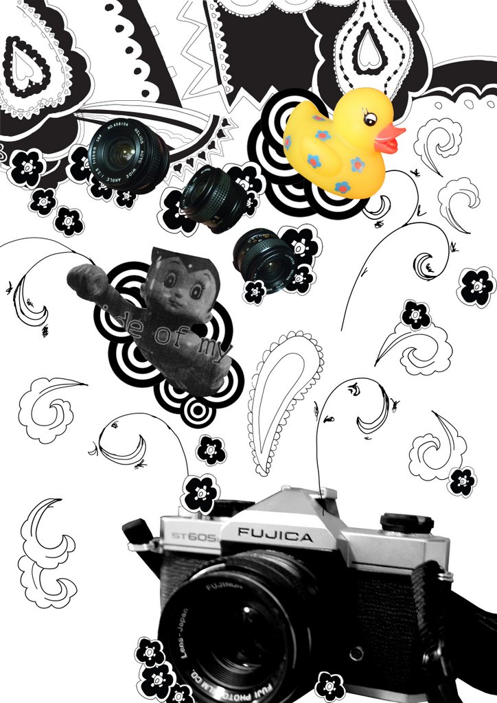
montage!!!
combination of hand drawn elements traced in illustrator and photographs. arranged in photoshop because i just feel more comfortable using it at the moment, and i don't want to waste time trying to figure out how to do simple things in illustrator when i know i can do it quickly in photoshop. i am getting used to illustrator though.
Thinking of doing some colour versions, i want to try using gradients and i want to see the effect different colours has on the image.
i think my hand is about to fall off.
13.10.06
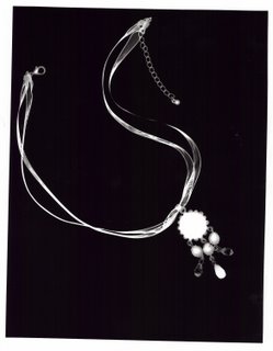
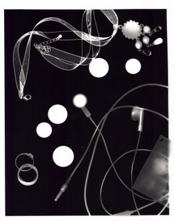
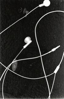
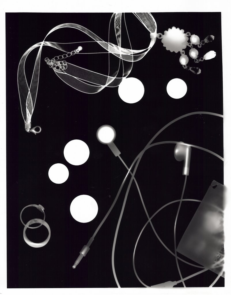
photograms
i've gone and reduced myself to the few things in my pockets and hanging around my neck.
faffing in darkroom.

faffing in darkroom.



12.10.06
final layout idea - comm design
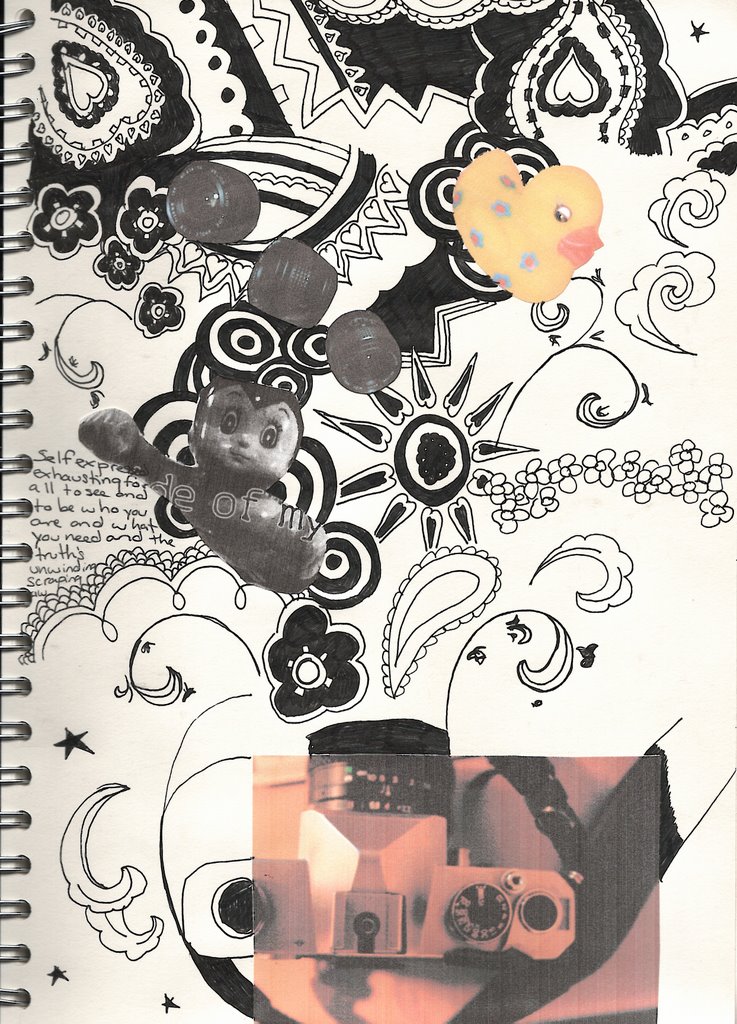
this is my final layout idea for the first brief. I think it looks a bit cluttered at the moment, too many ideas, but i think once it's blown up to A3 size it'll look better. I've decided to use a combination of the patterns from my scarves and candle holders to add some hand drawn elements to the image. i could scan in my scarves, but i like how the patterns look hand drawn, i think it also makes it more personal. so far i've included photos of my camera, lenses, techno duck and a photocopy from one of the posters i have on my wall.
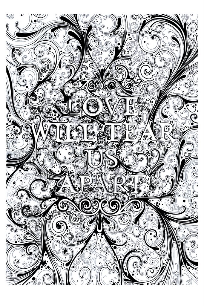
i think the layout has been influenced by some of si scotts work that has also made it's way onto my wall. especially this image:
I'm thinking of using colour in this image, well adding more than what's in the photographs anyway. i want to make the background patterns textured by crumpling up photocopies, but some elements, some of the flowers and swirls, will be made in illustrator.
i want the background pattern to be distressed, possibly using a gradient as well, and i'm thinking of using muted colours, maybe greens or browns. I'm not sure so i may just end up leaving the patterns in black, as it creates a striking image.
i want the image to show a range of my interests, from the silly things like ducks to my more serious love of photography. i want to include text in the background layers of the image, nothing too striking but i think this could be a way of including my interests of reading and music.
i think this image only needs developing a little bit more, there are some bits of the patterns i might like to change, and if possible i would like to include more photographs of my personal items.
cameras and ducks and pretty patterns - comm design

i first did some terrible doodles in my sketchbook, to make it feel like i was doing some work and try to think of elements i wanted to include in my montage. i also made a to do list. i discovered i was terrible at drawing ducks even though i love them, and i like the patterns on my candle holders and pretty stars.
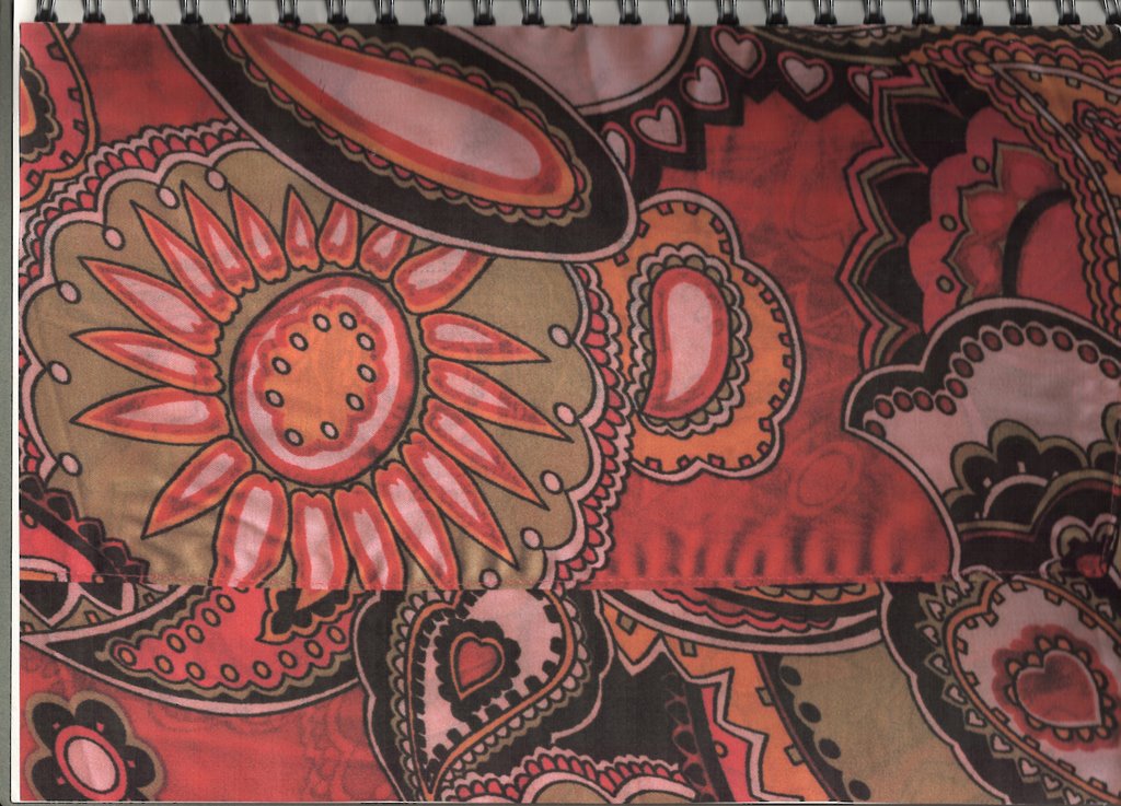
i decided i needed more to work with, i had only really taken photos of a few things which wasn't enough to make a whole montage. i also needed to bring in some illustration elements into the piece, and i think looking at patterns is a good way to develop ideas for layouts through looking at how all the elements come together. I decided to use the patterns on some of the scarves i like to wear as belts. i chose these two because of the bright colours and bold patterns.
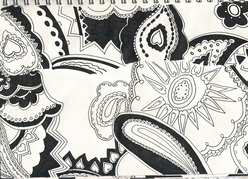
drawn just with a gel pen. which died. i really like the patterns in this drawing, and it's interesting to see how the patterns look as a two tone flat image. Could use live trace in illustrator to keep the flatness, or do some experimentation with photocopying and photoshop to create texture.
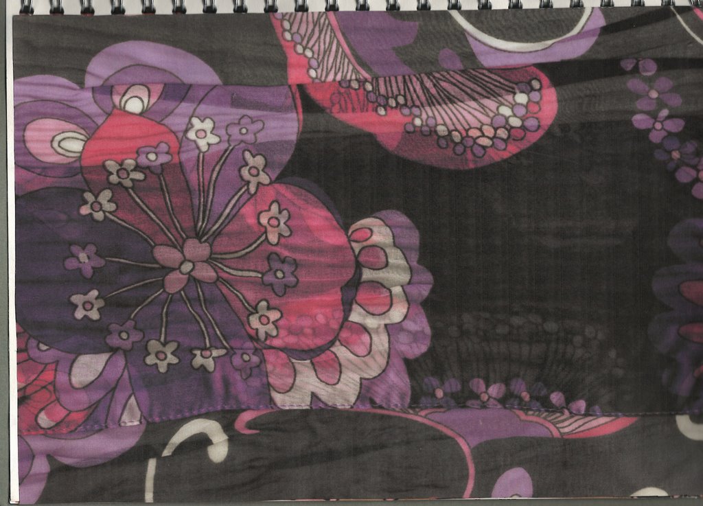
another scarf! (i'm wearing this one today.. arfarfarf.) i like how the thiness of the fabric has created an effect like messing around with opacity levels in photoshop. i also like the patterns and colours.
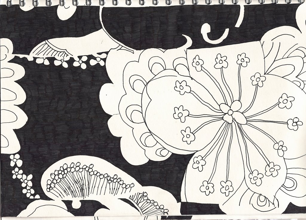
i lost the opacity effect when i drew this as a flat 2d image as i didn't want to over complicate it, i wanted to keep simple forms. I think some of the elements in this image could easily be reproduced in illustrator as part of my final montage, such as the petal patterns, or i could be lazy and use live trace.

this is my first layout idea, combining lots of different elements into one image, the main focus being on the little army of terribly drawn techno ducks, and the camera (that drawing was so bad i had to cover it up with a photo!) the circles would be the illustrator elements, and possibly the patterns aswell but i like how they look hand drawn.
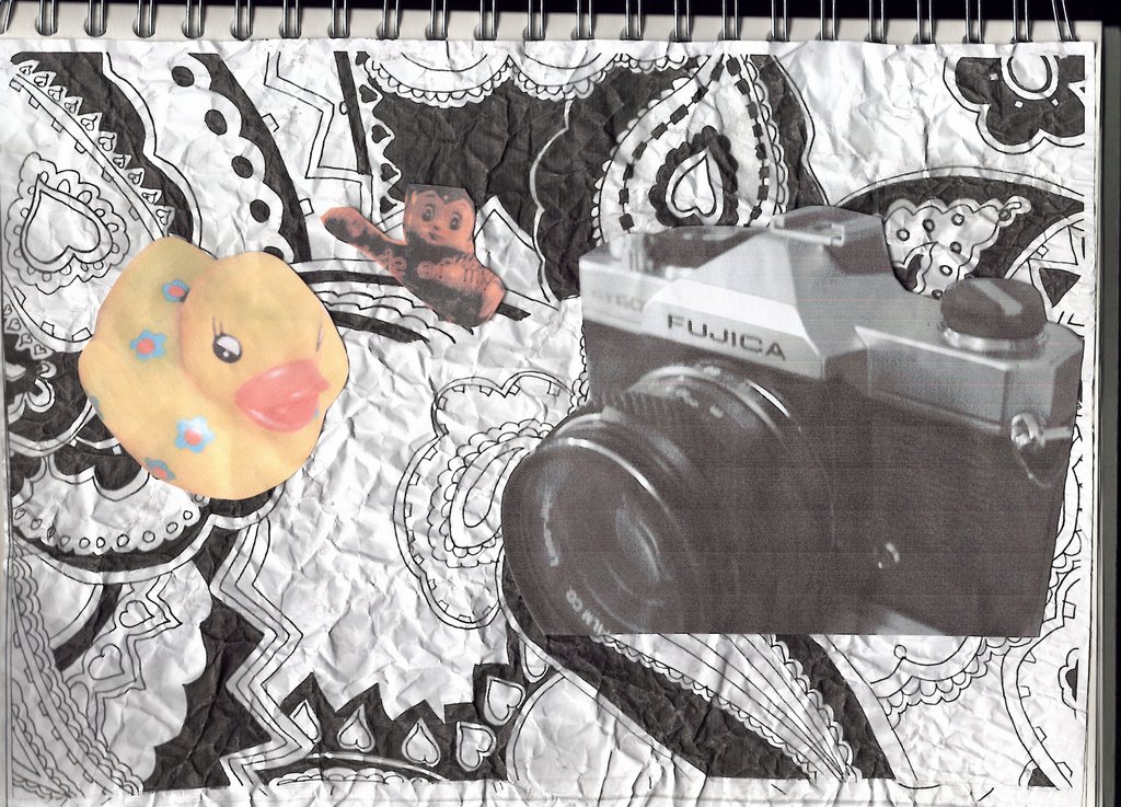
I wanted to make it look a bit textured, so i tried screwing up a photocopy of one of my pattern drawings to create a background that wasn't flat. i then added some of the elements i want to include in my montage, and then ran out of ideas and didn't know what else to do with it.

So i tried photocopying one of the photocopies i had screwed up, which creates an image with interesting texture that i think could be used in a layer in photoshop to make the image seem less flat.
photos for montage, maybe? - comm design
I still wasn't sure what i wanted to do, but i always feel much better when i've got a camera in my hand and have taken lots of photos, so this is what i did. the light in my room is terrible, so the photos aren't great and i sometimes tried using the flash which always comes out a bit crap. i took photos of some of the interesting things in my room, postcards and posters and the random useless things i tend to get attached to.

the now infamous techno duck. I love this duck a bit too much, but i don't care if it's wrong, he's amazing.
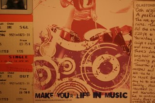
i stick postcards and other random images on my walls to hide the terrible paintwork and inspire me, or something. i really like the circles in this image, and the deteriorated effect.

i love these candle holders, i stare at them alot. i love the patterns on them, they're cheap japanese ripp offs i bought from internationale for £3. bargain. this photo also features little chicky, a little glass chicken a friend brought me from prague.

my sisters buy me cute teddies for my birthdays. aw.
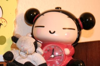
my broken pucca alarm clock, she's been a bit abused by morning me and now refuses to beep. there's also moo moo (the cow)
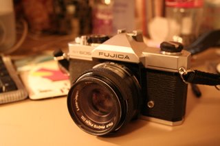
this is my pride and joy. vintage screw fit, falling apart and a little bit manky fujica SLR who's been on many an adventure with me. Since i love it and photography so much i definately want to use him in my montage.

so i took lots of photos of him.
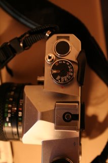
i'm interested in the dials and buttons. i like the idea of measurements and things.

the now infamous techno duck. I love this duck a bit too much, but i don't care if it's wrong, he's amazing.
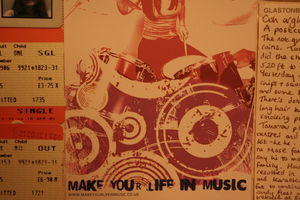
i stick postcards and other random images on my walls to hide the terrible paintwork and inspire me, or something. i really like the circles in this image, and the deteriorated effect.
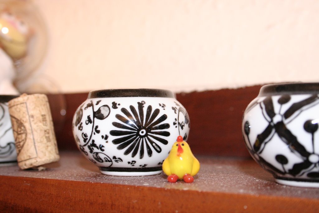
i love these candle holders, i stare at them alot. i love the patterns on them, they're cheap japanese ripp offs i bought from internationale for £3. bargain. this photo also features little chicky, a little glass chicken a friend brought me from prague.
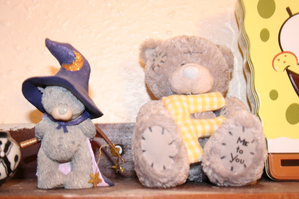
my sisters buy me cute teddies for my birthdays. aw.
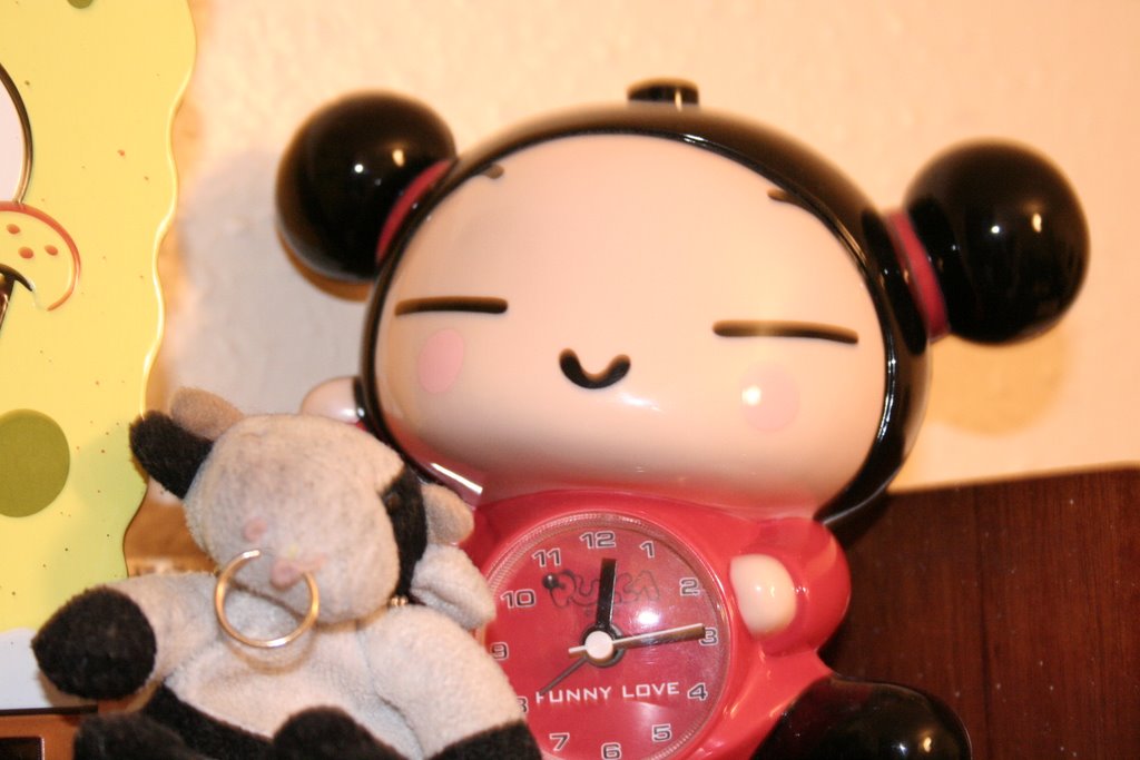
my broken pucca alarm clock, she's been a bit abused by morning me and now refuses to beep. there's also moo moo (the cow)

this is my pride and joy. vintage screw fit, falling apart and a little bit manky fujica SLR who's been on many an adventure with me. Since i love it and photography so much i definately want to use him in my montage.
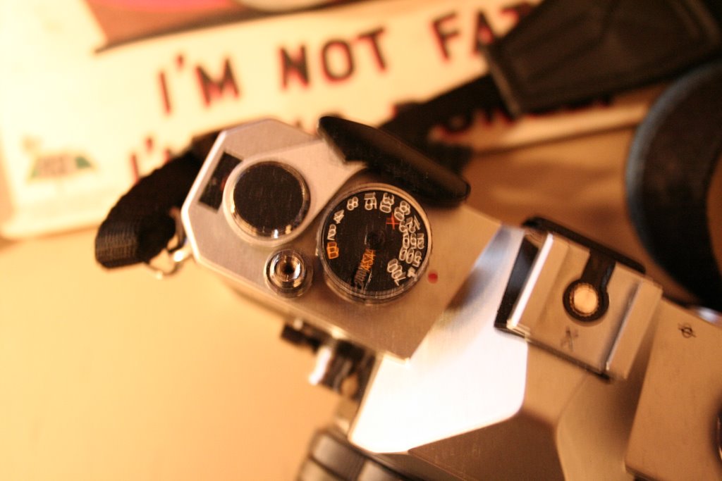
so i took lots of photos of him.
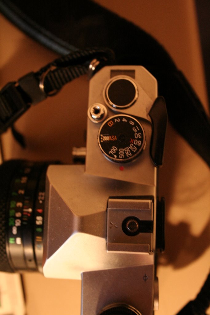
i'm interested in the dials and buttons. i like the idea of measurements and things.
7.10.06
my old addiction to computer arts pays off - comm web + print
(terrible scans incl.)
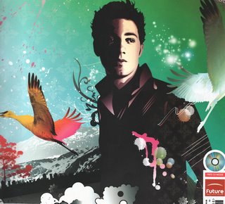 After thinking about the brief for a while i first thought of creating something along the lines of this. This image was produced in illustrator by Johnny Cheuk for a computer arts cover (Aug 2005), who's feature tutorial was how to use gradients in illustrator to add depth to 2d images, something Cheuk does all the time apparently. "I like to add gradients to my work. After all, gradation means variegation. I also like the effect of ink splashing and use arbitrary line drawings to humanize my illustrations and make up for the cold perfection" - (Johnny Cheuk, Computer arts, Aug 2005) I like his use of layers in this illustration to create texture, as vector images can sometimes seem flat, his use of colour and paint splashes adds life to the image.
 Another image by Johnny Cheuk, from the same issue of computer arts. I've decided to include this image aswell as the compostion of the montage is different from what i usually see. Most illustrations use compostions based on the rules from painting and photography (portrait, landscape etc) where this image is based around a cross. The elements of the image (cds, pens, paint) are used to make up another form. I also like the symmetry in the image.
 This image also featured in the same issue of computer arts is by GR/DD, a london based "graphic and interactive design consultancy". The image was designed for an article about design for mobiles, which is relfected in the imagery. I like the use of colour in the imagery, and even though it's textured it seems flatter than Johnny Cheuk's images, even though i think this image was made in photoshop (it seems pixelated in places and i think filters may have been used on some of the layers). I think some of the images may have been photocopied and then scanned in to create a deterioated effect, which is something i like doing and may do for this piece.
 Full image by GR/DD for computer arts Aug 2005
 After thinking about the brief for a while i first thought of creating something along the lines of this. This image was produced in illustrator by Johnny Cheuk for a computer arts cover (Aug 2005), who's feature tutorial was how to use gradients in illustrator to add depth to 2d images, something Cheuk does all the time apparently. "I like to add gradients to my work. After all, gradation means variegation. I also like the effect of ink splashing and use arbitrary line drawings to humanize my illustrations and make up for the cold perfection" - (Johnny Cheuk, Computer arts, Aug 2005) I like his use of layers in this illustration to create texture, as vector images can sometimes seem flat, his use of colour and paint splashes adds life to the image.
 Another image by Johnny Cheuk, from the same issue of computer arts. I've decided to include this image aswell as the compostion of the montage is different from what i usually see. Most illustrations use compostions based on the rules from painting and photography (portrait, landscape etc) where this image is based around a cross. The elements of the image (cds, pens, paint) are used to make up another form. I also like the symmetry in the image.
 This image also featured in the same issue of computer arts is by GR/DD, a london based "graphic and interactive design consultancy". The image was designed for an article about design for mobiles, which is relfected in the imagery. I like the use of colour in the imagery, and even though it's textured it seems flatter than Johnny Cheuk's images, even though i think this image was made in photoshop (it seems pixelated in places and i think filters may have been used on some of the layers). I think some of the images may have been photocopied and then scanned in to create a deterioated effect, which is something i like doing and may do for this piece.
 Full image by GR/DD for computer arts Aug 2005
Subscribe to:
Posts (Atom)