

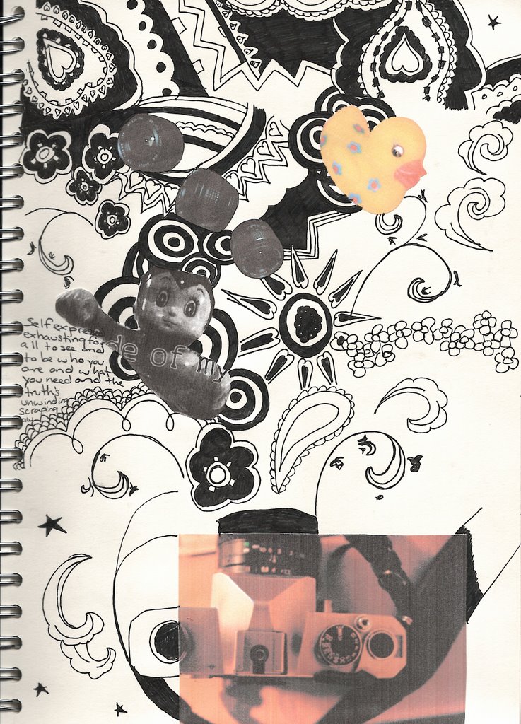
this is my final layout idea for the first brief. I think it looks a bit cluttered at the moment, too many ideas, but i think once it's blown up to A3 size it'll look better. I've decided to use a combination of the patterns from my scarves and candle holders to add some hand drawn elements to the image. i could scan in my scarves, but i like how the patterns look hand drawn, i think it also makes it more personal. so far i've included photos of my camera, lenses, techno duck and a photocopy from one of the posters i have on my wall.
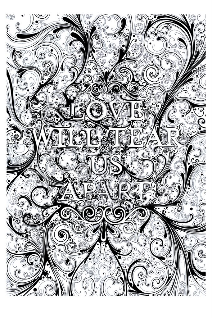
i think the layout has been influenced by some of si scotts work that has also made it's way onto my wall. especially this image:
I'm thinking of using colour in this image, well adding more than what's in the photographs anyway. i want to make the background patterns textured by crumpling up photocopies, but some elements, some of the flowers and swirls, will be made in illustrator.
i want the background pattern to be distressed, possibly using a gradient as well, and i'm thinking of using muted colours, maybe greens or browns. I'm not sure so i may just end up leaving the patterns in black, as it creates a striking image.
i want the image to show a range of my interests, from the silly things like ducks to my more serious love of photography. i want to include text in the background layers of the image, nothing too striking but i think this could be a way of including my interests of reading and music.
i think this image only needs developing a little bit more, there are some bits of the patterns i might like to change, and if possible i would like to include more photographs of my personal items.
No comments:
Post a Comment