i first did some terrible doodles in my sketchbook, to make it feel like i was doing some work and try to think of elements i wanted to include in my montage. i also made a to do list. i discovered i was terrible at drawing ducks even though i love them, and i like the patterns on my candle holders and pretty stars.

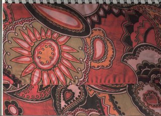
i decided i needed more to work with, i had only really taken photos of a few things which wasn't enough to make a whole montage. i also needed to bring in some illustration elements into the piece, and i think looking at patterns is a good way to develop ideas for layouts through looking at how all the elements come together. I decided to use the patterns on some of the scarves i like to wear as belts. i chose these two because of the bright colours and bold patterns.

drawn just with a gel pen. which died. i really like the patterns in this drawing, and it's interesting to see how the patterns look as a two tone flat image. Could use live trace in illustrator to keep the flatness, or do some experimentation with photocopying and photoshop to create texture.

another scarf! (i'm wearing this one today.. arfarfarf.) i like how the thiness of the fabric has created an effect like messing around with opacity levels in photoshop. i also like the patterns and colours.

i lost the opacity effect when i drew this as a flat 2d image as i didn't want to over complicate it, i wanted to keep simple forms. I think some of the elements in this image could easily be reproduced in illustrator as part of my final montage, such as the petal patterns, or i could be lazy and use live trace.

this is my first layout idea, combining lots of different elements into one image, the main focus being on the little army of terribly drawn techno ducks, and the camera (that drawing was so bad i had to cover it up with a photo!) the circles would be the illustrator elements, and possibly the patterns aswell but i like how they look hand drawn.

I wanted to make it look a bit textured, so i tried screwing up a photocopy of one of my pattern drawings to create a background that wasn't flat. i then added some of the elements i want to include in my montage, and then ran out of ideas and didn't know what else to do with it.

So i tried photocopying one of the photocopies i had screwed up, which creates an image with interesting texture that i think could be used in a layer in photoshop to make the image seem less flat.


No comments:
Post a Comment