(terrible scans incl.)

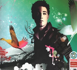
After thinking about the brief for a while i first thought of creating something along the lines of this. This image was produced in illustrator by Johnny Cheuk for a computer arts cover (Aug 2005), who's feature tutorial was how to use gradients in illustrator to add depth to 2d images, something Cheuk does all the time apparently. "I like to add gradients to my work. After all, gradation means variegation. I also like the effect of ink splashing and use arbitrary line drawings to humanize my illustrations and make up for the cold perfection" - (Johnny Cheuk, Computer arts, Aug 2005) I like his use of layers in this illustration to create texture, as vector images can sometimes seem flat, his use of colour and paint splashes adds life to the image.

Another image by Johnny Cheuk, from the same issue of computer arts. I've decided to include this image aswell as the compostion of the montage is different from what i usually see. Most illustrations use compostions based on the rules from painting and photography (portrait, landscape etc) where this image is based around a cross. The elements of the image (cds, pens, paint) are used to make up another form. I also like the symmetry in the image.

This image also featured in the same issue of computer arts is by GR/DD, a london based "graphic and interactive design consultancy". The image was designed for an article about design for mobiles, which is relfected in the imagery. I like the use of colour in the imagery, and even though it's textured it seems flatter than Johnny Cheuk's images, even though i think this image was made in photoshop (it seems pixelated in places and i think filters may have been used on some of the layers). I think some of the images may have been photocopied and then scanned in to create a deterioated effect, which is something i like doing and may do for this piece.

Full image by GR/DD for computer arts Aug 2005
 After thinking about the brief for a while i first thought of creating something along the lines of this. This image was produced in illustrator by Johnny Cheuk for a computer arts cover (Aug 2005), who's feature tutorial was how to use gradients in illustrator to add depth to 2d images, something Cheuk does all the time apparently. "I like to add gradients to my work. After all, gradation means variegation. I also like the effect of ink splashing and use arbitrary line drawings to humanize my illustrations and make up for the cold perfection" - (Johnny Cheuk, Computer arts, Aug 2005) I like his use of layers in this illustration to create texture, as vector images can sometimes seem flat, his use of colour and paint splashes adds life to the image.
 Another image by Johnny Cheuk, from the same issue of computer arts. I've decided to include this image aswell as the compostion of the montage is different from what i usually see. Most illustrations use compostions based on the rules from painting and photography (portrait, landscape etc) where this image is based around a cross. The elements of the image (cds, pens, paint) are used to make up another form. I also like the symmetry in the image.
 This image also featured in the same issue of computer arts is by GR/DD, a london based "graphic and interactive design consultancy". The image was designed for an article about design for mobiles, which is relfected in the imagery. I like the use of colour in the imagery, and even though it's textured it seems flatter than Johnny Cheuk's images, even though i think this image was made in photoshop (it seems pixelated in places and i think filters may have been used on some of the layers). I think some of the images may have been photocopied and then scanned in to create a deterioated effect, which is something i like doing and may do for this piece.
 Full image by GR/DD for computer arts Aug 2005


2 comments:
Nice research, i remember seeing this, infact i have it somewhere as im subscribed to computer arts, but it is almost run out :( must renew
Some great stuff you're looking at there. The GD/DD stuff reminds me of some Dada artwork, especially the montage work of Hannah Hoch.
Post a Comment