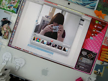
is now finished.
it's now black and purple.
to fit in with the build more.
there's gradients.
and a new shiny banner.
ning ning ning ning
14.12.07
developmental stuff...
that i would have posted ages ago but i was busy working so yeah.
i started off trying out different ideas for chairs, thinking of the cimema and seating areas, trying out different ideas. here's some floaty spherey chairs with textures that hurt the eye.

an idea which i nicked from "where's my space age?" by Sean Topham. These charis were origianlly made in 1968 by Eero Aamio.

i also tried out a video chair idea also from "where's my space age?", this time these "TV tanks" were made by LOT/EK from old oil tanks.


i then tried to adapt this idea into second life to create individual viewing areas.


but since there are no headphones in second life, and several people watching different videos at the same time would create a lot of noise i cut the chairs down a bit to go into a group cinema area instead.


this also meant the the viewing area could be much larger, allowing for more visitors.
the main part of the build which i worked on was the cinema area, creating a dark room where the avatars can walk on water which is quite a nice effect.

i also terraformed most of the build, and put in nice trees and grass on the island.

and i worked on the main sinage, but liam worked on the teleports.

i started off trying out different ideas for chairs, thinking of the cimema and seating areas, trying out different ideas. here's some floaty spherey chairs with textures that hurt the eye.

an idea which i nicked from "where's my space age?" by Sean Topham. These charis were origianlly made in 1968 by Eero Aamio.

i also tried out a video chair idea also from "where's my space age?", this time these "TV tanks" were made by LOT/EK from old oil tanks.


i then tried to adapt this idea into second life to create individual viewing areas.


but since there are no headphones in second life, and several people watching different videos at the same time would create a lot of noise i cut the chairs down a bit to go into a group cinema area instead.


this also meant the the viewing area could be much larger, allowing for more visitors.
the main part of the build which i worked on was the cinema area, creating a dark room where the avatars can walk on water which is quite a nice effect.

i also terraformed most of the build, and put in nice trees and grass on the island.

and i worked on the main sinage, but liam worked on the teleports.

Labels:
developmetal stuff,
second life,
second life gallery,
year two
7.12.07
also...
not that it will really be that noticeable since there was never anything there, but eternallymissed.org is down for the time being, as i'm moving hosts. the internet at this here student house is positively shat, and i can't even upload files with good old fashioned FTP, so i had to find a host that had cpanel.
hopefully this will actually inspire me to actually make a site.
i've gone with asmallorange.com, i don't know if they're any good yet, but with a name like that they must be.
tiny little oranges are going to host my website for me. that's so nice.
hopefully this will actually inspire me to actually make a site.
i've gone with asmallorange.com, i don't know if they're any good yet, but with a name like that they must be.
tiny little oranges are going to host my website for me. that's so nice.
Labels:
asmallorange.com,
cpanel,
eternallymissed.org,
ftp,
shat,
website,
year two
every now and then
you come across a website that's really pretty. that says "Yes, there is more to the internet than myspace".
the website i came across (or rather visited for the first time in ages) is brendan dawes' website. he changes it every five minutes but i really like the current layout. it's nice and clean, and the current interface with it bouncy pixels makes you want to interact with it. once rolled over the bouncy pixels which reflect how many comments the post got, turn into a clear image. it's all to do with visualizing blog activity.
another little thing he's made that visualizes blog activity is the info mouse thing where you click and drag your mouse across the page, and as the words appear the black ink in the mouse depletes. it's COOL.
another pretty website i found today is flight404 which features some damn sexy work done with processing.
someone please teach me processing now.
please.
i want to...
kill the college network.
it deserves to die.
i've got the ning all set up and running, there's photos and the machinema walkthrough, aswell as a twitter feed from second life which needs a bit more tweaking, at the moment it only listens to me. the layout colours of the ning are based on the colours of the gallery, to keep a theme going.
i'm planning to make a link from the gallery in world to the ning, but at the moment second life keeps having spazams.
i would show you pretty photos of the gallery, but i can't, as second life wont open.
GARAAARAAAGGAAAHHHH.
Labels:
die,
machinema,
ning,
second life,
second life gallery,
year two
2.12.07
the cinema area...
30.11.07
today (and yesterday)
i have mostly been terraforming. and making the area cinema area.
this is what the build looks like so far.


this is what the build looks like so far.


Labels:
second life,
second life gallery,
terraforming,
year two
22.11.07
the current college galleries...
i thought it might be a good idea to look at the current college galleries, on the island aswell as the one in Gourdneck, to see what kind of presence the college already has in second life.

this is the current college gallery building that is on the island, it's in the same style as the building in Gourdneck, and features the college logo on some nice wavy banners.

this is the entrance / hallway area. there isn't much information here as a notecard is provided when you teleport onto the island.
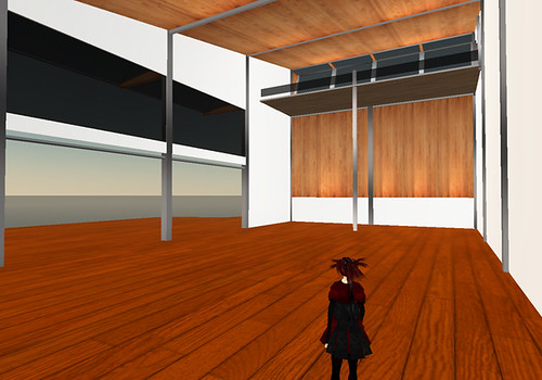
this is the main gallery space, which is pretty bare at the moment. most of the work is scattered around the island.
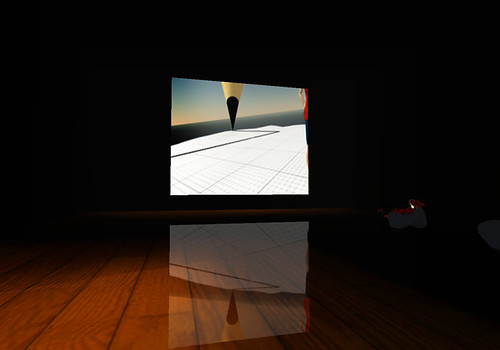
and this is the cinema area, which features very nice sculptie chairs and a very cool reflection effect on the floor. shadows have also been painted onto the floor to make it seem darker.

and this is the outdoor gallery space, which actually has some work displayed! and another lovely wavy college logo banner.

this is the college building at Gourdneck on the main grid, so people can accidentally come across it as opposed to choosing to teleport to the college island. there's alot more going on in the surrounding area, and it comes with it's own giant jesus.
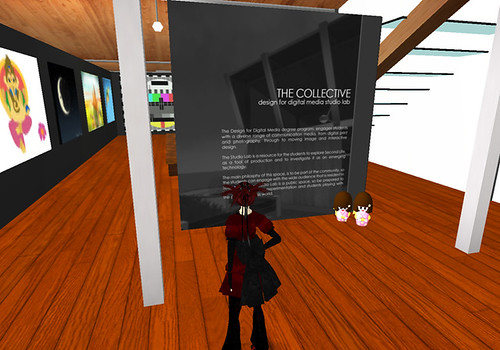
this is the entrance area, with a poster/wall detailing what the gallery holds in it and the philosophy etc.
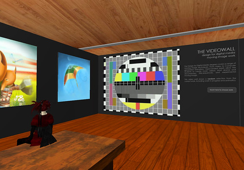
threre's a video wall inside the gallery space showing students work next to the 2d work.

there's a small upstairs area which is accessed by stairs...
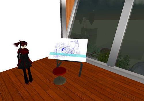
which holds several objects including this easel which links to a website..

and this laptop in the seating area which links to a blog.
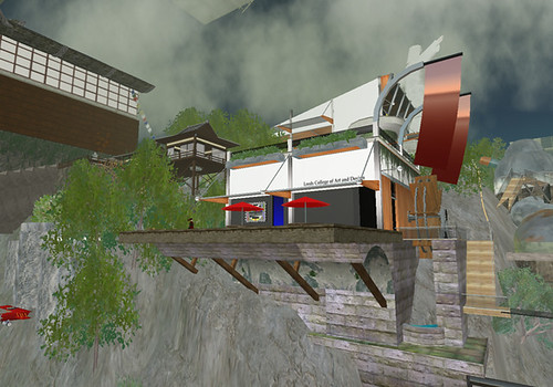
there's also a seperate cinema building which is accessed from the main building by a teleport.

and this is what it looks like on the inside. it's quite different from the cinema at the island, it's much brighter on the inside.

this is the current college gallery building that is on the island, it's in the same style as the building in Gourdneck, and features the college logo on some nice wavy banners.

this is the entrance / hallway area. there isn't much information here as a notecard is provided when you teleport onto the island.

this is the main gallery space, which is pretty bare at the moment. most of the work is scattered around the island.

and this is the cinema area, which features very nice sculptie chairs and a very cool reflection effect on the floor. shadows have also been painted onto the floor to make it seem darker.

and this is the outdoor gallery space, which actually has some work displayed! and another lovely wavy college logo banner.

this is the college building at Gourdneck on the main grid, so people can accidentally come across it as opposed to choosing to teleport to the college island. there's alot more going on in the surrounding area, and it comes with it's own giant jesus.

this is the entrance area, with a poster/wall detailing what the gallery holds in it and the philosophy etc.

threre's a video wall inside the gallery space showing students work next to the 2d work.

there's a small upstairs area which is accessed by stairs...

which holds several objects including this easel which links to a website..

and this laptop in the seating area which links to a blog.

there's also a seperate cinema building which is accessed from the main building by a teleport.

and this is what it looks like on the inside. it's quite different from the cinema at the island, it's much brighter on the inside.
20.11.07
there's more...
oh yes.
another gallery i looked at was the Columbia college gallery.
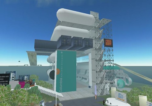
which is pretty interesting looking to say the least. and probably the only building i've looked at so far to really think about how people move around and interact with second life.

the gallery looks interesting from the outside aswell, i really like the shapes they've used, and the mix of space age white spheres and cheap looking wood and steel crates.
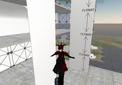
the building is designed around the avatars ability to fly, there's no stairs to climb and there's plenty of space to fly around. the building isn't that tall either, allowing for those that don't have flight enhancement scripts. although the building is quite small in comparison to somewhere like arts and letters there's still plenty of space to house work.
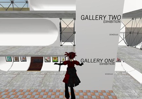
the gallery is split into floors, meaning more than one exhibition can be held at a time. there are signs all around the building detailing what the gallery is, the different areas and how to get around.
as a gallery in second life i think this building works really well. it's well designed, thought out and feels like a building without feeling too boring.
another gallery i looked at was the Columbia college gallery.

which is pretty interesting looking to say the least. and probably the only building i've looked at so far to really think about how people move around and interact with second life.

the gallery looks interesting from the outside aswell, i really like the shapes they've used, and the mix of space age white spheres and cheap looking wood and steel crates.

the building is designed around the avatars ability to fly, there's no stairs to climb and there's plenty of space to fly around. the building isn't that tall either, allowing for those that don't have flight enhancement scripts. although the building is quite small in comparison to somewhere like arts and letters there's still plenty of space to house work.

the gallery is split into floors, meaning more than one exhibition can be held at a time. there are signs all around the building detailing what the gallery is, the different areas and how to get around.
as a gallery in second life i think this building works really well. it's well designed, thought out and feels like a building without feeling too boring.
19.11.07
some other gallerys...
i found wandering around the place....
the first one i'm going to talk about is arts and letters, which, to put it bluntly, is HUGE. everything about it is huge... the space is huge, the sculptures are huge...
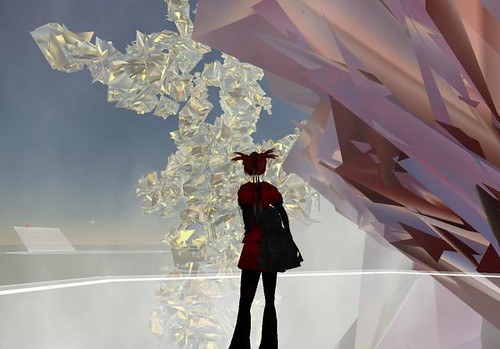
but that's about it really...
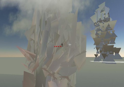
it's just really, really, big.
the sculptures are messed up sculpties i think, i've made something similar with random textures before, just on a much smaller scale.
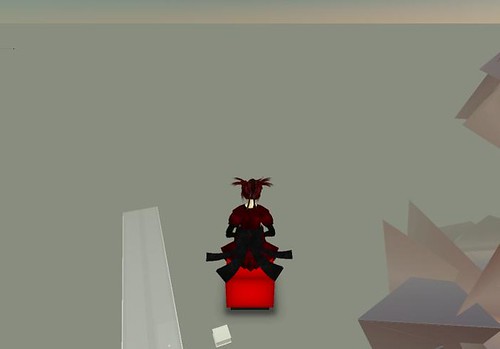
the one good thing about the place is transportation to the different areas by cube

which is quite fun.
i also found the princeton gallery, which has some very interesting and well built architecture,i don't know if it's built from basic prims or not but it's very impressive!
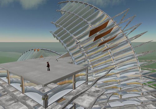
but is a bit bland on the inside i think...

the first one i'm going to talk about is arts and letters, which, to put it bluntly, is HUGE. everything about it is huge... the space is huge, the sculptures are huge...

but that's about it really...

it's just really, really, big.
the sculptures are messed up sculpties i think, i've made something similar with random textures before, just on a much smaller scale.
the one good thing about the place is transportation to the different areas by cube

which is quite fun.

i also found the princeton gallery, which has some very interesting and well built architecture,i don't know if it's built from basic prims or not but it's very impressive!

but is a bit bland on the inside i think...

Labels:
arts and letters,
princeton,
second life,
second life gallery,
year two
16.11.07
odyssey sim in SL
as part of my research into gallerys in second life, i have been wandering around the Odyssey sim, having a little looksie at what proper artists are doing.
this is the main building in the sim, which is quite impressive on the outside. the structure abandons uneccesary things such as pillars and structural support although it still has a roof (not much need for one as there isn't any rain, but it does make it feel more like a building i guess).

i like the futurist style of the building and the use of basic prims, and since it's so big it creates a nice sense of space. the size of the building also means that the camera doesn't suddenly dissapear behind a wall making it easier for the visitor to wander around without adjusting the camera too much.
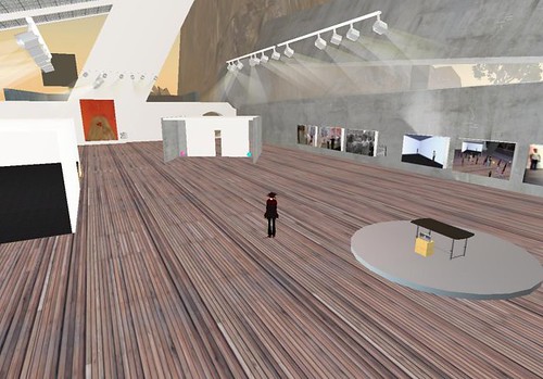
this building is holding 2d work by 0100101110101101.org at the moment, most of which is placed on the walls like a traditional gallery. the lights also don't rely on any kind of support and there's areas where you avatar can re-enact some of the art works. the inside of a building feels alot like a traditional gallery with wooden floors and art work on the walls. the large space makes you want to wander around, and the space feels light.
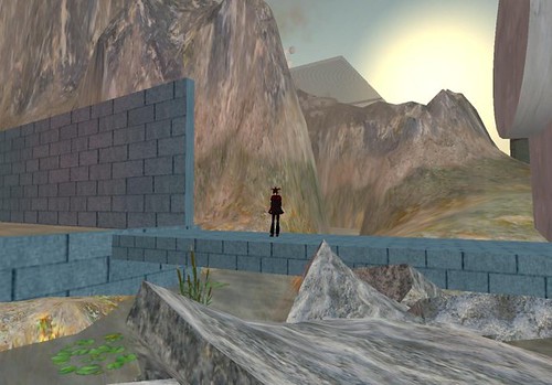
to the back of the building there's a river, and the land has been terraformed to create mountains. i think this creates a really nice relaxing environment, even though there is no real water creating a relaxing atmosphere, i think our experince of nice rivers is transferred onto the virtual representation of it. which is why i think people also like to make buildings that look like buildings.
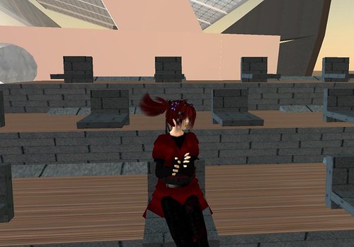
there is a video display area behind the river, complete with clapping animations in the seats.

there's also lots of dirt in this area, which i think is a really nice effect, making what would natrually be pristine look a bit grim.

i love these seats! this is another video / talk area which has been put in the middle of the mountains. it has seats that look more like a sculpture than a place to sit, and they also include avatar animations.
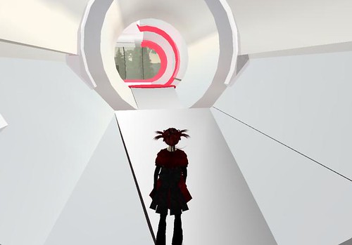
there are a few other buildings spotted around the island, this one which holds optical illusions, makes me feel like i'm going into 2001.

there's also a mental hospital, which takes over your avatar and makes it bounce constantly, making it very difficult to control!
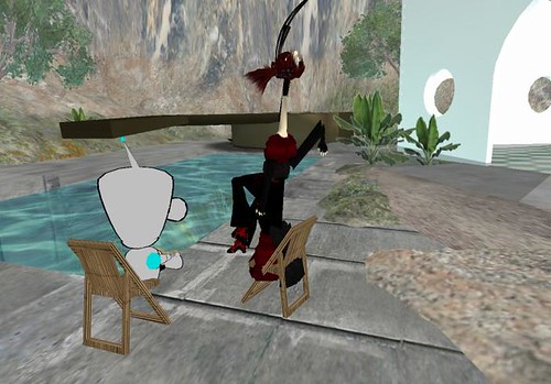
there's also a "pain chair" outside the mental hospital, which distorts your avatar (that's liam laughing at me).
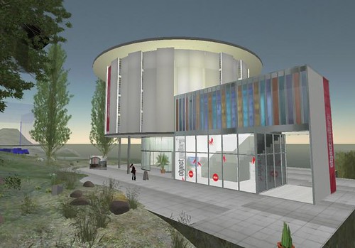
another building on the island is a replica of the real life object gallery, which holds the same exhibition as the real life building about second life architecture.
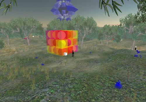
alot of 3d sculpture is held outside of any buildings, you wander around a field until you bump into something or make a sound. there's a lot of good sculptures around, most of which create sound when you interact with them...
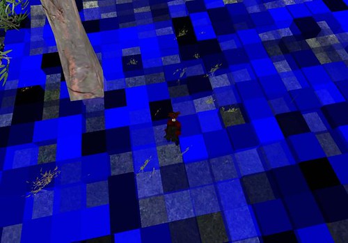
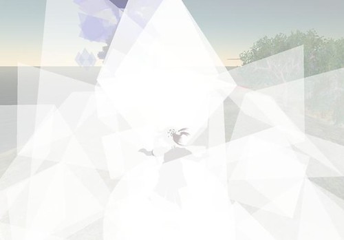
especially when they engulf your av...
i think the Odyssey sim is a really interesting place, it feels like a gallery whislt trying to see what can be done in second life, letting the artwork speak for itself instead of trying to generate a WOW!! factor. alot of the artwork there is actually brilliant aswell.
this is the main building in the sim, which is quite impressive on the outside. the structure abandons uneccesary things such as pillars and structural support although it still has a roof (not much need for one as there isn't any rain, but it does make it feel more like a building i guess).

i like the futurist style of the building and the use of basic prims, and since it's so big it creates a nice sense of space. the size of the building also means that the camera doesn't suddenly dissapear behind a wall making it easier for the visitor to wander around without adjusting the camera too much.

this building is holding 2d work by 0100101110101101.org at the moment, most of which is placed on the walls like a traditional gallery. the lights also don't rely on any kind of support and there's areas where you avatar can re-enact some of the art works. the inside of a building feels alot like a traditional gallery with wooden floors and art work on the walls. the large space makes you want to wander around, and the space feels light.

to the back of the building there's a river, and the land has been terraformed to create mountains. i think this creates a really nice relaxing environment, even though there is no real water creating a relaxing atmosphere, i think our experince of nice rivers is transferred onto the virtual representation of it. which is why i think people also like to make buildings that look like buildings.

there is a video display area behind the river, complete with clapping animations in the seats.

there's also lots of dirt in this area, which i think is a really nice effect, making what would natrually be pristine look a bit grim.

i love these seats! this is another video / talk area which has been put in the middle of the mountains. it has seats that look more like a sculpture than a place to sit, and they also include avatar animations.

there are a few other buildings spotted around the island, this one which holds optical illusions, makes me feel like i'm going into 2001.

there's also a mental hospital, which takes over your avatar and makes it bounce constantly, making it very difficult to control!

there's also a "pain chair" outside the mental hospital, which distorts your avatar (that's liam laughing at me).

another building on the island is a replica of the real life object gallery, which holds the same exhibition as the real life building about second life architecture.

alot of 3d sculpture is held outside of any buildings, you wander around a field until you bump into something or make a sound. there's a lot of good sculptures around, most of which create sound when you interact with them...

especially when they engulf your av...

i think the Odyssey sim is a really interesting place, it feels like a gallery whislt trying to see what can be done in second life, letting the artwork speak for itself instead of trying to generate a WOW!! factor. alot of the artwork there is actually brilliant aswell.
Subscribe to:
Comments (Atom)


