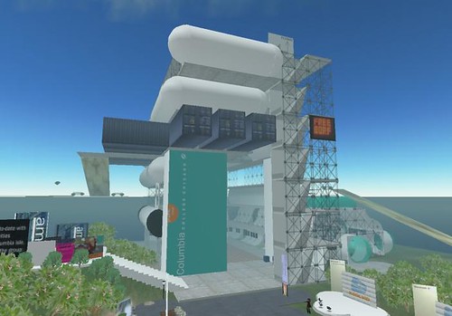
another gallery i looked at was the Columbia college gallery.

which is pretty interesting looking to say the least. and probably the only building i've looked at so far to really think about how people move around and interact with second life.

the gallery looks interesting from the outside aswell, i really like the shapes they've used, and the mix of space age white spheres and cheap looking wood and steel crates.

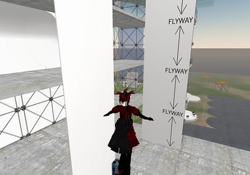
the building is designed around the avatars ability to fly, there's no stairs to climb and there's plenty of space to fly around. the building isn't that tall either, allowing for those that don't have flight enhancement scripts. although the building is quite small in comparison to somewhere like arts and letters there's still plenty of space to house work.

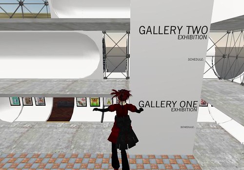
the gallery is split into floors, meaning more than one exhibition can be held at a time. there are signs all around the building detailing what the gallery is, the different areas and how to get around.
as a gallery in second life i think this building works really well. it's well designed, thought out and feels like a building without feeling too boring.


No comments:
Post a Comment