30.11.07

today (and yesterday)

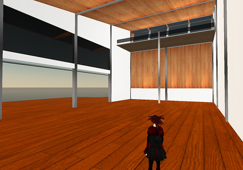
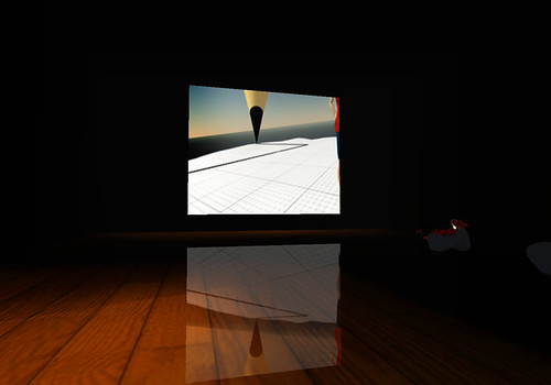
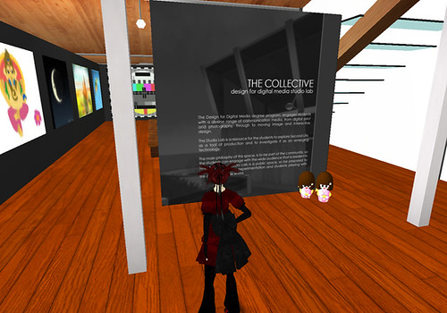
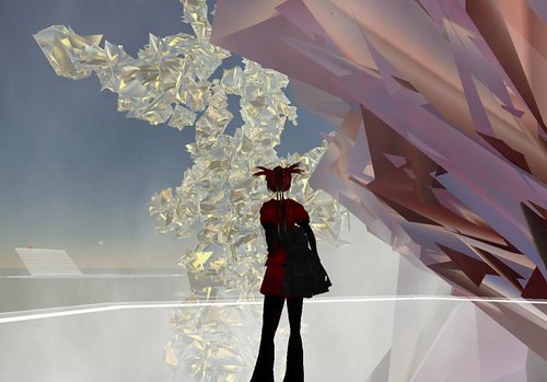
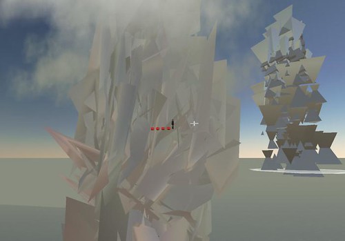
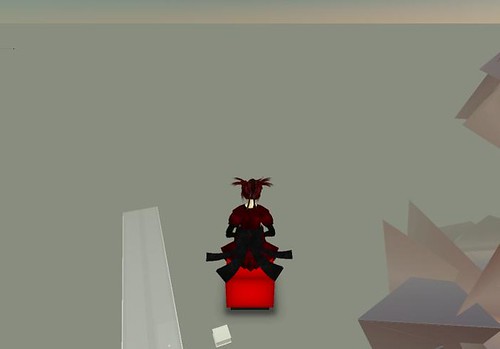
i have mostly been terraforming. and making the area cinema area.
this is what the build looks like so far.


22.11.07

the current college galleries...

i thought it might be a good idea to look at the current college galleries, on the island aswell as the one in Gourdneck, to see what kind of presence the college already has in second life.


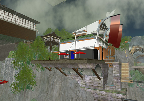
this is the current college gallery building that is on the island, it's in the same style as the building in Gourdneck, and features the college logo on some nice wavy banners.


this is the entrance / hallway area. there isn't much information here as a notecard is provided when you teleport onto the island.


this is the main gallery space, which is pretty bare at the moment. most of the work is scattered around the island.


and this is the cinema area, which features very nice sculptie chairs and a very cool reflection effect on the floor. shadows have also been painted onto the floor to make it seem darker.


and this is the outdoor gallery space, which actually has some work displayed! and another lovely wavy college logo banner.


this is the college building at Gourdneck on the main grid, so people can accidentally come across it as opposed to choosing to teleport to the college island. there's alot more going on in the surrounding area, and it comes with it's own giant jesus.


this is the entrance area, with a poster/wall detailing what the gallery holds in it and the philosophy etc.


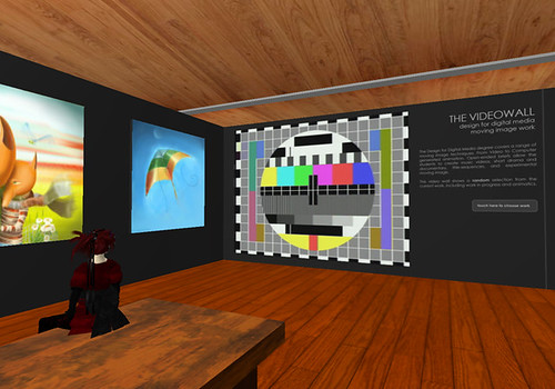
threre's a video wall inside the gallery space showing students work next to the 2d work.


there's a small upstairs area which is accessed by stairs...


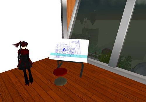
which holds several objects including this easel which links to a website..


and this laptop in the seating area which links to a blog.


there's also a seperate cinema building which is accessed from the main building by a teleport.


and this is what it looks like on the inside. it's quite different from the cinema at the island, it's much brighter on the inside.

20.11.07

there's more...

oh yes.

another gallery i looked at was the Columbia college gallery.

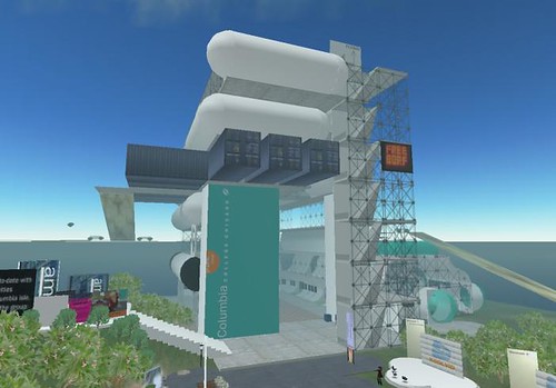
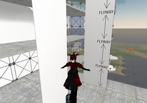
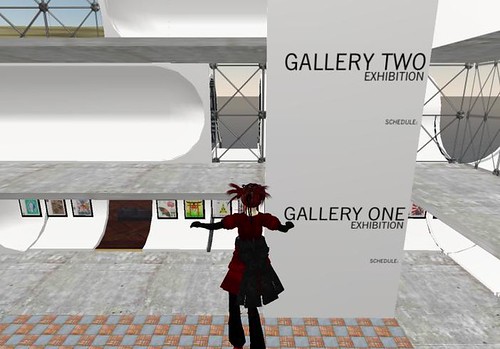
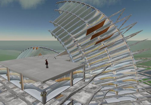
which is pretty interesting looking to say the least. and probably the only building i've looked at so far to really think about how people move around and interact with second life.


the gallery looks interesting from the outside aswell, i really like the shapes they've used, and the mix of space age white spheres and cheap looking wood and steel crates.


the building is designed around the avatars ability to fly, there's no stairs to climb and there's plenty of space to fly around. the building isn't that tall either, allowing for those that don't have flight enhancement scripts. although the building is quite small in comparison to somewhere like arts and letters there's still plenty of space to house work.


the gallery is split into floors, meaning more than one exhibition can be held at a time. there are signs all around the building detailing what the gallery is, the different areas and how to get around.

as a gallery in second life i think this building works really well. it's well designed, thought out and feels like a building without feeling too boring.

19.11.07

some other gallerys...

i found wandering around the place....

the first one i'm going to talk about is arts and letters, which, to put it bluntly, is HUGE. everything about it is huge... the space is huge, the sculptures are huge...

but that's about it really...

it's just really, really, big.
the sculptures are messed up sculpties i think, i've made something similar with random textures before, just on a much smaller scale.

the one good thing about the place is transportation to the different areas by cube

which is quite fun.


i also found the princeton gallery, which has some very interesting and well built architecture,i don't know if it's built from basic prims or not but it's very impressive!


but is a bit bland on the inside i think...

16.11.07

odyssey sim in SL

as part of my research into gallerys in second life, i have been wandering around the Odyssey sim, having a little looksie at what proper artists are doing.

this is the main building in the sim, which is quite impressive on the outside. the structure abandons uneccesary things such as pillars and structural support although it still has a roof (not much need for one as there isn't any rain, but it does make it feel more like a building i guess).

i like the futurist style of the building and the use of basic prims, and since it's so big it creates a nice sense of space. the size of the building also means that the camera doesn't suddenly dissapear behind a wall making it easier for the visitor to wander around without adjusting the camera too much.
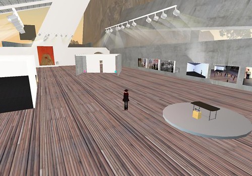

this building is holding 2d work by 0100101110101101.org at the moment, most of which is placed on the walls like a traditional gallery. the lights also don't rely on any kind of support and there's areas where you avatar can re-enact some of the art works. the inside of a building feels alot like a traditional gallery with wooden floors and art work on the walls. the large space makes you want to wander around, and the space feels light.
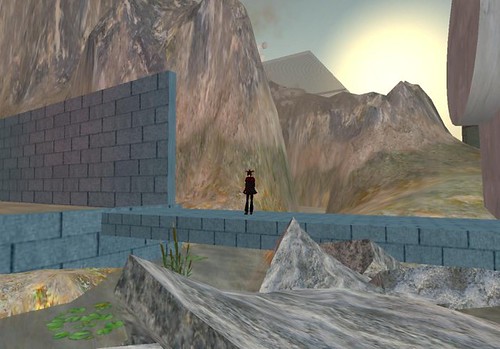

to the back of the building there's a river, and the land has been terraformed to create mountains. i think this creates a really nice relaxing environment, even though there is no real water creating a relaxing atmosphere, i think our experince of nice rivers is transferred onto the virtual representation of it. which is why i think people also like to make buildings that look like buildings.
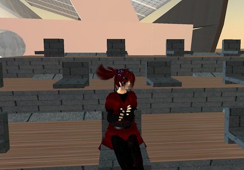

there is a video display area behind the river, complete with clapping animations in the seats.


there's also lots of dirt in this area, which i think is a really nice effect, making what would natrually be pristine look a bit grim.


i love these seats! this is another video / talk area which has been put in the middle of the mountains. it has seats that look more like a sculpture than a place to sit, and they also include avatar animations.
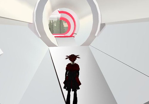

there are a few other buildings spotted around the island, this one which holds optical illusions, makes me feel like i'm going into 2001.


there's also a mental hospital, which takes over your avatar and makes it bounce constantly, making it very difficult to control!
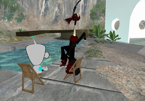

there's also a "pain chair" outside the mental hospital, which distorts your avatar (that's liam laughing at me).
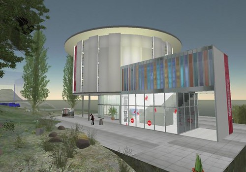

another building on the island is a replica of the real life object gallery, which holds the same exhibition as the real life building about second life architecture.
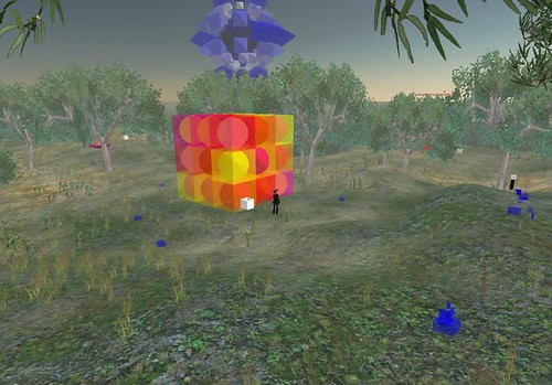

alot of 3d sculpture is held outside of any buildings, you wander around a field until you bump into something or make a sound. there's a lot of good sculptures around, most of which create sound when you interact with them...
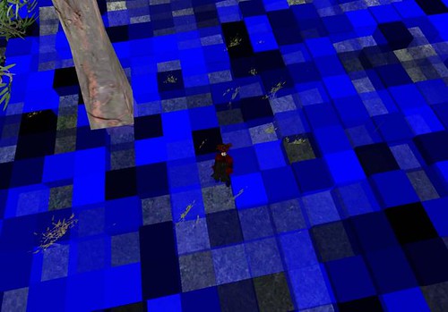
especially when they engulf your av...
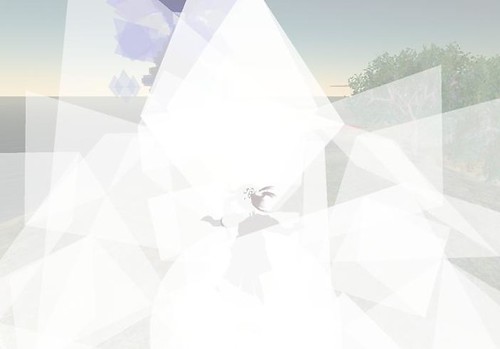

i think the Odyssey sim is a really interesting place, it feels like a gallery whislt trying to see what can be done in second life, letting the artwork speak for itself instead of trying to generate a WOW!! factor. alot of the artwork there is actually brilliant aswell.

15.11.07

new shiny work area

for me and liam to develop our ideas and try things out and stuff.


and i'm a pretty fairy.

i've scanned in stuff from my pretty book, "where's my space age?", and liam has posted what he's found wondering around second life, and sketches of some of his ideas.

13.11.07

i want one!!!

ALAVS

these... are... so... cool...

ALAVS (Autonomous Light Air Vessels) are amazing pretty little blimp robots that are really quite cool. they FLOAT. and they're pretty.

ALAVS 1.0 had three programmed behaviours; ALAV with a person, ALAV with other ALAVs, and ALAV alone. when an ALAV is alone for a while it emits a call, to find the rest of the flock and get some attention. if a person wants to interact with an ALAV they have to wait till they're hungry (which is shown by the colours of a dangly LED thing), and then the person can feed them with a pretty light.

ALAVS 2.0 use mobile phones to let people interact with the ALAVS more than just feeding them. using an IVR system (Interactive Voice Recognition) a person can interact with the whole group of ALAVS or one. their behaviour changes depending on wether or not the ALAV percieves the person as a friend or foe.

there's also BLUBBER BOTS!!!
they also respond to mobile phone activity, so if you wave your phone about you can attract their attention, and they'll respond with a song or a dance. they also seek put the strongest source of light and flock when in a group.
best of all you can buy them.

i want one so much it hurts.

12.11.07

interactive design rationale

i've decided to work on the second life gallery space brief, and since we're allowed to work in pairs on this one i will be working with liam.
i chose this brief because it has the second life element and the social network site, so i'll be getting a chance to develop my second life skills and my web 2.0 ones aswell. and i want to see what is possible with emerging web technologies.

what both me and laim are hoping to do with this brief is to make something in second life that reflects the possibilities of what can be done there, instead of relying on something based on what we see in real life. although i think it will be worthwhile looking at some real life architecture to see how we could adapt these ideas into second life. we want to get across the idea of what is possible in a metaverse instead of creating a comfort zone.

i'd also like the chance to play with twitter again, and i'm hoping that since i'm working in a pair this time i can work on my group skills some more.

8.11.07

evaluation of ident.

When I first decided to work on the brief for “Custard”, the only thing I was certain of was that I wanted to make something bright and annoying. I’m quite good at making annoying things, and getting better at making bright things, so I saw this brief as a chance to develop my skills further, also wanting to get my head around Illustrator a bit more whilst learning Aftereffects as well.

I started off my research with children’s programs that I already knew of (Pocoyo) and had recently come across (YO! Gabba Gabba), looking at the style of animation and the narrative. YO! Gabba Gabba gave me an Idea of what I wanted my sound design to be like, and how to use simple animated elements. Pocoyo just embodied cuteness itself. I also looked at idents for Cbeebies and CBBC, to see how the channels branded themselves and the style of animation that was used, which was pretty much anything goes. I was struggling to come up with ideas at this stage, so looked at other cute things that interested me, like the Kawaii not comics by Meghan Murphy, and the Katamari Damacy game intros.

Katamari Damacy really helped to get my ideas going, the style of animation was quite simple but looked really good, with lots of hyper-rainbows and dancing pandas. My first idea was based on the Cbeebies’ yellow blobs, Katamari’s hyper-rainbows, and YO! Gabba Gabba’s strange costumes. I wanted to have some actors in animal costumes having a tea party in a park, but since I couldn’t afford to rent costumes (at £25 each minimum), and as masks were likely to be more scary than cute, I had to abandon this idea.

I instead decided to look at the programs that were on CBBC on a Sunday morning, hoping to use the characters from the show in my ident. I spent the next couple of weeks recording the shows, going through them and cutting out images to use. This part of the project was the most painful, as children’s TV is incredibly mind numbing, and boring, and nonsensical. I had to watch the Chuckle Brothers!! The pain!

I ended up only using a few of the programs from the Sunday morning line up, to save on time animating and to keep the ident shorter. After I had the images I wanted I storyboarded the new idea which was based on the idea of rainbows flying around and text popping up and characters bouncing around the place.

Animating the idea was a bit daunting as I’ve never used Aftereffects before, and there were lots of elements to work with. But it turned out that it’s not as complicated as everyone makes out and I got my head around it in pretty much a day. If I could make the ident again, I’d like to work on the sound design more, I think what I used works with the images but it would have been nice to make something of my own.

7.11.07

fonts and that

after some deliberation and going through different macs fontbooks and searching around websites i have decided which font to use... (well i decided a while ago but was too busy working to be blogging)


yeah...it's childish without being too kiddy, and i think it suits the animation. i put the white border around it to seperate it from the rainbows as i'm using the same colours in the background and text.


so that's what i've done...

2.11.07

website-ness.

i've been in a right making things mood today.

i've started working on mine and lukes website again, working on my side of it...

here's what i'm currently thinking is going to be my main page:

and contact page:


the idea for the site is that they're our sketchbooks kinda thing. so i'm making my layouts in real life in a sketchbook, as i want mine bit to have texture and not look like i've done it all in dreamweaver. the plan is to nick a digital SLR and take nice photos of the pages when they're all finished, then put the layers for text and thumbnails on top... and maybe add more elements to the backgrounds on pooter.

and now i'm going to stop playing with my glue gun. and PVA. it's not just any PVA, it's art attack, neil buchanan endorsed PVA.

art attack rules!! YEAH.