the perverts guide to cinema
with all those pennies you'll be getting from santa.
21.12.06
20.12.06
meep
12.12.06
Aniamtion evaluation (hehe that ryhmes)
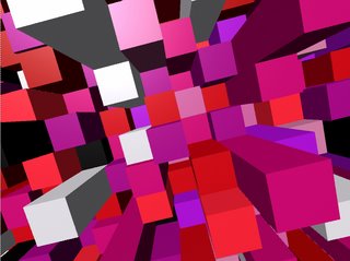
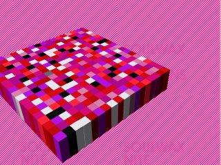
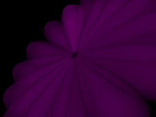
I’m really happy with my animation, it’s the first proper animation I’ve ever done, and the first time I’ve used maya, so I’m quite proud I’ve managed to get something that works, let alone works this well. I think some of the synchronization is off in the first six seconds, but I think I’ve managed to synchronize the rest quite well. I think my decision to abandon some of my ideas and not include the “whooshy floower” or army of marching toys was right, the cubie thing is enough to hold the viewers attention, it’s an interesting object in itself, there was no need to add anything else to the animation.
I don’t think I planned my time effectively, I ended up only spending three weeks on the final piece, the rest of the term was spent learning the programs and doing research. I found it difficult to storyboard ideas when I was unsure of what I would be able to do with the programs. I was sure I wanted to do something in maya as 3d interests me so much, but I was tempted to do something in flash as I have previous experience in using the program. I’ve ended up using both maya and flash, which I think was effective. It would have taken me weeks to animate each individual cube to the music in maya, where as in flash I was able to use the frames exported from maya of the cubes moving, and then synchronize it to the music in flash. I would have liked to have done it all in maya, it would have been nice to experiment more with the movement of the cubes, but I think it still works well.
If I was going to do this project again, I would like to give myself more time to actually make my final piece and experiment in maya some more, I feel most of my experimentation was done whilst making the final piece, which was a bit frustrating as I had to concentrate on getting the thing done instead of really pushing it further.
7.12.06
when i close my eyes all i see is pink cubes - animation
6.12.06
critical studies notebook - links + bibliography
image analysis exercise
picture essay
critical review of Barthes Mythologies
thomas ruff portraits review
constructivism definition
other critical blog enteries:
oh my gosh i love tate modern
i've been reading...
semiotics
bibliography:
Picture essay - Sean Topham, 2003, "Where's My Space Age?", Prestel
critical review of Barthes Mythologies - Roland Barthes, 1957, "Mythologies", Vintage
Thomas Ruff portraits review - Tate Modern, 2006, "UBS Openings: Photography From The UBS Art Collection" leaflet, Tate
- Thomas Ruff interview, last acsessed - 6/12/06
- tate magazine, last acsessed 6/12/06
constructivism definition - wikipedia entry, last acsessed 6/12/06
oh my gosh i love tate modern - johnny hardstaff podcast, last acsessed 6/12/06
i've been reading - Terence Hawkes, 1977, "Structuralism and Semiotics", New Accents
semiotics - Roland Barthes, 1957, "Mythologies", Vintage
- Terence Hawkes, 1977, "Structuralism and Semiotics", New Accents
thomas ruff - critical studies
Thomas Ruff believes that photographs can only show the surface of things. Photographs don’t explain anything to you, tell you of the subjects history or tell you what happened the moment before or after the photograph was taken. All photographs can do is show the skin of a reality that goes much deeper.
Nowhere is this idea more apparent than in his series “Portraits”, part of tate modern’s “UBS Openings: Photography From The UBS Art Collection” exhibition. These photographs taken by Ruff of his friends and family give no details of the subject’s life. Each photograph resembles a passport ID photo blown up to larger than real life size, each face expressionless, void of personality. The odd glimpse of individuality is lost within the rows of anonymous faces, the effect of which is disorientating. Your eye desperately searching for something that will tell you anything about these people’s lives, something that will allow you to build a story, offering these uknown faces a place in space and time. But there’s no such relief, just a growing sense of unease as you wonder why these people look at you with an air of distaste, like something they scraped off the bottom of their shoe.
Ruff studied photography under the Bechers in the late 1970’s, renouned for their style of detachment and use of only black and white photography. But Ruff soon decided to use colour in the Portraits series which he started in 1981, still studying at the Düsseldorf academy, stating that “colour is close to reality. The eye sees in colour.” And that “Black and white is too abstact for me”, challenging the traditional black and white documentary tradition of photography.
Ruff’s portraits are a reaction to the “terrorismushysterie”, the secret service that observed people opposed to nuclear power, and the “berufsverbot”, where left-wing teachers were dismissed in the 1970’s. Which he uses to explain why these faces are so expressionless, “why should my portraits be communicative at a time when you could be prosecuted for your sympathies?”
These pictures question photography’s ability to show what’s real, the semblance to reality is apparent. Ruff says “photography pretends”, it only touches the surface of things, unable to go any deeper it pretends to show a mirror image of reality.
5.12.06
constructivism - critical studies
Constructivism is an art movement that was founded by Vladimir Tatlin in 1913 in Russia. Constructivists believed that art could be used for social purposes and the development of a socialist state. Heavily influenced by industrial design and technology, constructivist art often had political messages, affected by the revolution.
Barthes was a plastic fetishist - critical studies
Mythologies – Roland Bathes 1957
One of the myths explored in Barthes Mythologies is the ‘myth’ of plastic. In this section of the book Barthes explores the effect of this relatively new material on people’s perceptions natural materials, and ‘imitation materials’:
“Until now imitation materials have always indicated pretension, they belonged to the world of apperances, not to that of actual use; they aimed at reproducing cheaply the rarest substances… all the luxurious brilliance of the world. Plastic has climbed down, it is a household material.” - (Barthes, Mythologies, 1957, pg 98)
all at once able to become buckets aswell as jewels, plastic allowed itself to be swallowed up in the process of making the final product, where as natural materials cling on to their former qualities. Barthes describes the process of using plastic to make dressing room tidies as “the magical operation par excellence: the transmutation of matter” liking the the machines attendant to a “half-god, half robot” capable of performing this alchemy but appearing braindead, unaware of this miracle.
Barthes seems to celebrate plastics qualities, it’s ability to become almost anything, “plastic is the very idea of it’s infinite transformation”, realizing that this new substance means that objects will be created simply for the pleasure of using them, this new material making imaginable the “invention of forms”.
But at the same time he describes it as a non-object “powerless to achieve the smoothness of nature”:
“a disgraced material, lost between the effusiveness of rubber and the flat hardness of metal; it embodies none of the genuine produce of the mineral world” - (Barthes, Mythologies, 1957, pg 98)
The idea of plastic being a non-object seems to me to be a striking idea. The majority of the world seems to be made of plastic, we’re living in a world populated with non-objects. These items that have no tactile quality, you barely notice them when you hold them.
4.12.06
comm des research (or lets make my presentation easier if i can use a projector)
masters of photography
This is the website i mostly got my idea from. It contains loads of information but the design isn't brilliant, it's very simple and uses tables for its text based layout, and it's absolutley full of pop ups and google ads, which makes it very frustrating to use, even with a popup blocker. They tried to do something with the font for headers, and the graphics used aren't great but they are kind of relevant to the subject, but the layout lets it down. there's the oppurtunity to do alot more with the design, i think.
The layout of the navigation is a bit confusing, each photographer has their own section, which contains links to articles, photographs and resources.
profotos
This is the 'masters' section of a website that's a photography community. In other sections photographers can post links to their websites and get feedback, which i think is a great idea. But the design of this website really confuses me! what the hell i going on with the man in an anorak? with that massive lens he looks like a pervert. There's a rock face in the background aswell, i don't think the images used really convey what this website is about, it's meant to be a photographic resource and community but it looks like a website for anorak wearing, clock climbing, telephoto lens abusing old men.
fox talbot museum
This website is so terrible i had to include it. Everything wrong with the internet is symbolised by this page. Well, almost.
but there are some nice websites out there...
nicephore-niepce
French website by the Paris photo school about the inventor of photography. The index page uses a very image based design, with and 'olde worlde' font, which gives the website a very historical feel. The main website uses frames to make a layout which allows for a lot of information and text to be contained on the pages. I think this is a good website because it has a sense of identity, it knows the message it wants to get across to it's audience.
also, when i say the web site name it souds like "nice for niepce" which i think is nice.
Jerry Uelsmann
there is hope!
and it comes in the form of the official website for the photographer Jerry Uelsmann, who's great.
It's a flash based website, which uses simple graphics in a very effective way. Makes me go "OOOOH", and makes the navigation enjoyable to use. Large amounts of text are in scroll boxes which leaves more space for lots of images, I think a similar layout could easily be produced with div layers. I like this website because it feels like you're interacting with it, not just using it. And it has lots of interesting stuff on there.
3.12.06
brainstorming / first scrawls resembling an idea - comm des

^ what i think a photography website should be like
brainstorming possible sections, what i want some of the pages to contain, what i want the design to be like.

^ possible images / graphics to use in layout
trying to get past the obvious use of images, managed to come up with a possible colour scheme and the definate exclusion of men in anoraks (profotos)

^ things i want to avoid
tables, rows and rows of text, confusing navigation, anoraks, dark dingy design.

^ first scrawl resembling a decent idea
using div layers and if i can figure it out an external CSS document for layout and colour scheme (which i think is going to be white, red and black... inspired by darkroom colours. i don't care if the darkroom at LCAD is amber, they're supposed to be red!) trying to figure out where i'm going to place images and text, blah blah blah.
An interesting idea that i've come up with is to have three different ways of finding the photographer you want to look at, you could look through them by name, thumbnail (a nice little crop of one of their photos maybe) and movement, but not sure if i'll be able to do the last one with my limited knowledge of the history of photography.
2.12.06
30.11.06
second time i've animated this thing
semiotics presentation - critical studies
just incase anyone was interested in what i said, because i said it all really quickly and couldn't explain anything well as it was morning and i was very aware of how geeky i am.
Semiotics
“Human culture is made up of signs, each of which stands for something other than itself, and the people inhabiting culture busy themselves making sense of those signs.” - (Mieke Bal and Norman Bryson, Visual Methodologies)
Semiotics was first established by the Swiss linguist and structuralist Ferdinand de Sassure. Semitotics is part of structuralism, which attempts to explain language as a structure. That parts of the language (such as words) abide by it’s rules (grammar, spelling etc), and outside of the system of language, the parts and rules are meaningless.
Structuralism
The world does not consist of independently existing objects, the method of perception affects how the object is perceived.
Objective perception is not possible, as the observer “creates” something of what they observe.
So the only thing that can be observed is the relationship between between the observed and observer.
“It becomes the stuff of reality itself… In consequence the true nature of things may be said not to lie in things themselves, but in the relationships which we construct, and then percieve between them.” - (Terence Hawkes, Structuralism and Semiotics)
A structure (such as language) is self regulating, and it’s parts (words or signs) have no meaning unless they are integrated into the structure.
No reality exists outside of the reality created by the language itself, “In the end, it constitutes it’s own reality”
Our own reality is based on the structure of the language in the society in which we live. No two languages share the same “social reality”.
Language is more than a problem solver for communication, the “real world” is built upon the language habits of the group.
Language exists outside of history and reality, it creates it’s own.
Parole and Langue
Langue - the whole language and all of it’s rules (grammar, spelling etc) and it’s components or parts (words)
Parole - the individuals use of language, (speech) which causes a language to evolve
If you’re going to have a conversation, you have to abide by the rules of language so what you’re saying is understandable, but language is capable of transforming itself due to new combinations of it’s components, which happens in the event of speech.
signified and signifier

“The signified is the concept, the signifier is the acoustic image (which is mental) and the relation between concept and image is the sign (the word for instance), which is a concrete entity.” - (Roland Barthes, Mythologies)
Or…
“A sign is always thing plus meaning” - (Williamson, Visual methodologies)
other terminology
Icon - signifier represents signified by apparently having a likeness to it
Index - inherent relationships between signified and signifier
Symbol - conventional but clearly arbitrary relation between signified and signifier (babies representing future etc.)
Objective correlates - certain objects become taken for granted as having certain properties
Mortise - image of the product framed in some way
Mythology and Semiotics
“The ideas of the ruling class are in every age the ruling ideas.. In order to sustain these structures the dominant groups attempt to represent the world in forms that reflect their own interests, the interests of their power.” - (Marx and Engles / Hodge and Kress - Visual Methodologies)
Roland Barthes published ‘Mythologies’ in 1957, the book is a collection of essays which examine the myths present in French culture. It also describes the concept of myth as a “Second order semiological system”, adding to the following diagram shown earlier.


As we can see, the sign taken from the first semiological system is transformed into a signifier in the generation of the myth. Language itself has been reduced to signifier. The meaning generated by the original signifier and signified is hidden by the new meaning.

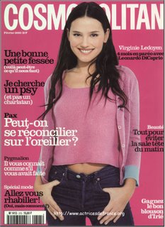
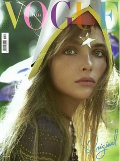
All of these images have used myth to create new meaning.
The original meaning, has been hidden behind the myth of beauty and happiness. These characters seem enviable, happy, beyond conflict and unique.
The actual reality or history of the model and the situation is abandoned or ignored (she could have been the smelly, spotty girl who was unhappy and hated, happiness could be an illusion, we have no idea what’s happening outside of the frame, they could have been photoshopped), all that remains is her likeness which has been transformed into a myth.
But the old meaning still remains, hidden under the surface, which helps make the myth credible.

“Myth hides nothing: it’s function is to distort, not to make disappear.” - (Barthes, Mythologies)


You’ve probably noticed that these are “My little ponies”, these are cropped images taken from adverts, I’ll show the full ones in a minute.
Any guesses what they’re doing?

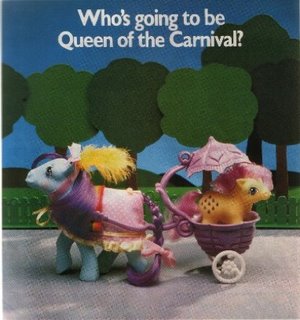
The text works as anchorage, telling the viewer what is supposed to be going on in these strange situations that have no resemblance to reality. Horses don’t live in pink castles and ride around in prams etc.
There also seems to be a recurring theme of royalty, which is probably supposed to convince little girls they need expensive things to be worthwhile.

“Faced with this world of faithful and complicated objects, the child can only identify himself as owner, as user, never as creator; he does not invent the world, he uses it… he is turned into a little stay-at-home householder who does not even have to invent the mainsprings of adult causality; they are supplied to him ready made: he is never allowed to discover anything from start to finish.” - (Barthes, Mythologies)
“Myth has in fact a double function: it points out and it notifies, it makes us understand something and it imposes it on us.” - (Barthes, Mythologies)
“Yet, because ads are so pervasive and our reading of them so routine, we tend to take for granted the deep social assumptions embedded in advertisements: we do not ordinarily recognize them as a sphere of ideology.” - (Goldman, Visual Methodologies)
“Ideology is the meaning made necessary by the conditions of society while helping to perpetuate those conditions. We feel a need to belong, to have a social ‘place’; it can be hard to find. Instead we may be given an imaginary one.” - (Williamson, Visual Methodolgies)
Semiotics
“Human culture is made up of signs, each of which stands for something other than itself, and the people inhabiting culture busy themselves making sense of those signs.” - (Mieke Bal and Norman Bryson, Visual Methodologies)
Semiotics was first established by the Swiss linguist and structuralist Ferdinand de Sassure. Semitotics is part of structuralism, which attempts to explain language as a structure. That parts of the language (such as words) abide by it’s rules (grammar, spelling etc), and outside of the system of language, the parts and rules are meaningless.
Structuralism
The world does not consist of independently existing objects, the method of perception affects how the object is perceived.
Objective perception is not possible, as the observer “creates” something of what they observe.
So the only thing that can be observed is the relationship between between the observed and observer.
“It becomes the stuff of reality itself… In consequence the true nature of things may be said not to lie in things themselves, but in the relationships which we construct, and then percieve between them.” - (Terence Hawkes, Structuralism and Semiotics)
A structure (such as language) is self regulating, and it’s parts (words or signs) have no meaning unless they are integrated into the structure.
No reality exists outside of the reality created by the language itself, “In the end, it constitutes it’s own reality”
Our own reality is based on the structure of the language in the society in which we live. No two languages share the same “social reality”.
Language is more than a problem solver for communication, the “real world” is built upon the language habits of the group.
Language exists outside of history and reality, it creates it’s own.
Parole and Langue
Langue - the whole language and all of it’s rules (grammar, spelling etc) and it’s components or parts (words)
Parole - the individuals use of language, (speech) which causes a language to evolve
If you’re going to have a conversation, you have to abide by the rules of language so what you’re saying is understandable, but language is capable of transforming itself due to new combinations of it’s components, which happens in the event of speech.
signified and signifier

“The signified is the concept, the signifier is the acoustic image (which is mental) and the relation between concept and image is the sign (the word for instance), which is a concrete entity.” - (Roland Barthes, Mythologies)
Or…
“A sign is always thing plus meaning” - (Williamson, Visual methodologies)
other terminology
Icon - signifier represents signified by apparently having a likeness to it
Index - inherent relationships between signified and signifier
Symbol - conventional but clearly arbitrary relation between signified and signifier (babies representing future etc.)
Objective correlates - certain objects become taken for granted as having certain properties
Mortise - image of the product framed in some way
Mythology and Semiotics
“The ideas of the ruling class are in every age the ruling ideas.. In order to sustain these structures the dominant groups attempt to represent the world in forms that reflect their own interests, the interests of their power.” - (Marx and Engles / Hodge and Kress - Visual Methodologies)
Roland Barthes published ‘Mythologies’ in 1957, the book is a collection of essays which examine the myths present in French culture. It also describes the concept of myth as a “Second order semiological system”, adding to the following diagram shown earlier.


As we can see, the sign taken from the first semiological system is transformed into a signifier in the generation of the myth. Language itself has been reduced to signifier. The meaning generated by the original signifier and signified is hidden by the new meaning.


All of these images have used myth to create new meaning.
The original meaning, has been hidden behind the myth of beauty and happiness. These characters seem enviable, happy, beyond conflict and unique.
The actual reality or history of the model and the situation is abandoned or ignored (she could have been the smelly, spotty girl who was unhappy and hated, happiness could be an illusion, we have no idea what’s happening outside of the frame, they could have been photoshopped), all that remains is her likeness which has been transformed into a myth.
But the old meaning still remains, hidden under the surface, which helps make the myth credible.

“Myth hides nothing: it’s function is to distort, not to make disappear.” - (Barthes, Mythologies)


You’ve probably noticed that these are “My little ponies”, these are cropped images taken from adverts, I’ll show the full ones in a minute.
Any guesses what they’re doing?


The text works as anchorage, telling the viewer what is supposed to be going on in these strange situations that have no resemblance to reality. Horses don’t live in pink castles and ride around in prams etc.
There also seems to be a recurring theme of royalty, which is probably supposed to convince little girls they need expensive things to be worthwhile.

“Faced with this world of faithful and complicated objects, the child can only identify himself as owner, as user, never as creator; he does not invent the world, he uses it… he is turned into a little stay-at-home householder who does not even have to invent the mainsprings of adult causality; they are supplied to him ready made: he is never allowed to discover anything from start to finish.” - (Barthes, Mythologies)
“Myth has in fact a double function: it points out and it notifies, it makes us understand something and it imposes it on us.” - (Barthes, Mythologies)
“Yet, because ads are so pervasive and our reading of them so routine, we tend to take for granted the deep social assumptions embedded in advertisements: we do not ordinarily recognize them as a sphere of ideology.” - (Goldman, Visual Methodologies)
“Ideology is the meaning made necessary by the conditions of society while helping to perpetuate those conditions. We feel a need to belong, to have a social ‘place’; it can be hard to find. Instead we may be given an imaginary one.” - (Williamson, Visual Methodolgies)
28.11.06
27.11.06
26.11.06
comm design rationale (i wanna make a website because they're good)
Although I enjoyed working on my montage and working with print, I want to develop my web making skills further, so I have decided to make a website.
I first thought of possibly making a website to promote a film or book, but after some thought I have decided to make a photography website or resource for students. This way I am working with a subject that interests me, and attempting to fill what I think is a gap in what is avaidable on the internet. I have used the websites avaidable (that I was able to find), and most whilst containing useful information were poorly designed, difficult to navigate and full of google ads and pop ups.
I want to make a well designed website that is easy to navigate and use, which contains a lot of information but still uses graphics and images to make it into more of an visual experience.
The target audience of my website will mainly be students (photography, possibly multimedia / graphic design / fine art students), and possibly teachers and lecturers aswell.
I want to survey a group of people from my target audience to find out what information they look for and want on a photography website, but possible sections could be equipment, history of photography, recommended books, and information on upcoming exhibitions. I want to make the information on the website relevant to what my target audience want, so I’ll be asking them about their favourite photographers, cameras, websites and also their other interests, so I can get an idea of what kind of design would be suited to my target audience.
I think web design is best suited for this idea as it can keep up to date with new events easily, can easily contain a lot of information and can utilise multimedia to make slideshows of photographers work or something.
23.11.06
website online
my website is now online! and without nasty adverts, and all for $7.
at the moment it's just the one i made last week for the brief, hopefully i'll be able to find time to make it into a lovely fully fledged dynamic wonderful full of information and images phwoarsome entity.
college work, slobbing, sleep, reading, eating, housework and nap times permitting.
click me
at the moment it's just the one i made last week for the brief, hopefully i'll be able to find time to make it into a lovely fully fledged dynamic wonderful full of information and images phwoarsome entity.
college work, slobbing, sleep, reading, eating, housework and nap times permitting.
click me
oh my gosh i love tate modern
i was there yesterday... oh yes.
reasons why i love tate:
Johnny Hardstaff lecture podcast - download
you must download and listen to these lectures. the first also includes scott eaton from supernatural studios (supernatural studios), who mostly talks about digital sculpture and takes you through the development of a digital scultpture of a greek titan who gets his stomach eaten out everyday by an overly chubby fairy grandmother. it's interesting.
Even more interesting is Johnny Hardstaffs talk where he asks not how we make digital media but why. if you havent seen any of his work (you silly, silly person) get yourself educated:
johnny hardstaff
personally, i think he's a genius.
It's a very inspirational lecture, where he discusses the ethics of design, wether or not digital media will ever be accepted by contemporary art, and the effect of digital mass media.
some lovely, lovely quotes:
"If you can imagine it, you can make it and it's as real as anything else. The definition of real has gone, and i think that is glorious. And we're all making our imagined worlds that we live in and the question is, to what extent are these pollutted by the commercial agendas of others, to what extent are they really us?"
"Designers can speak to the public in a language they understand, they speak this language. Well they don't speak it but they can read it and largely they can because they've always been meant to, they've been schooled and educated in it."
"Work inspired by technology itself, or by a new plugin is always going to be crass and invalid, theyre isn't going to be anything real there, that's not enough. All too often you see that, there's no substance behind that."
"The irony is digital technologies not only facilitate our liberties but they encroach on them aswell. They give you it and they take it away, and it's up to you to determine what it is... embrace photoshop but make it work for you in the design of marxist pamphlets that you can distribute, running through the streets."
YUM.
also...
exhibtions i did see, and you should too because they're great.
rings of saturn
i had to pretty much run around this one as i was about to miss my coach, but it is gorgeous. Unlike anything i've seen before. The work feels surreal but with a very contemporary edge. Some brilliant photography and sculpture.
UBS Photography exhibition
Thomas Ruff, Andreas Gursky... some other people i'm probably forgetting and will be kicking myself for later. wow. It features "99cent" by Gursky (follow the link for an image that doesn't do it justice) which is a great example of his work, photographs the size of walls, which are sometimes manipulated in sublte ways, which makes what looks like an authentic image feel unreal. I think he uses a large format camera (he must do, the photographs are huge), the people in the photographs are blurred, it looks like they don't belong in the environment they are in, which is brightly coloured and strangley symmetrical.
This exhibition also features Thomas Ruff's "Portraits", which i've read about but never seen. Rows of portraits which tell you very little of the person that has been photographed. Every face looks indifferent, baring nothing (Ruff believes that photographs can only show the surface of things) and making you wander why they're all looking at you like something they scraped off their shoe. Kinda makes you question wether or not you're worth something... or maybe that's just me.
Olivo Barbieri is also included in this exhibition. He usually photographs from above, and uses a depth of field technique to make the subjects look like models that have been placed by a malavelent giant child who might turn on them at any minute. once again, that might just be me.
states of flux
collection of design, photography and film (ie. heaven)
machine eye
If you have even the slightest interest in photography, you should go see this pernament display. I was stood drooling in front of several photographs by Rodchenko (russian constructivist who's photographs are absolutely brilliant. Influenced by the idea of 'ostrananie', or making the everyday strange, he is the master of forshortening), Stiegltiz (founder of "straight" photography), and Atget (working at the same time as Stiegltiz but virtually unknown in his lifetime). There was so much joy in my heart when i was in that room! i learnt about all these people last year and it was brilliant to see their work.
USSR in construction
i love constructivism. i love Rodchenko and Varvara Stepanova. I love El Lissitsky. And now that i know that Nikolai Troshin was the magazines art director i love him too. The compostitions are influenced by ideas of constructivism and suprematism, which basically means they're brilliant. Stalinist propaganda with avant garde design. go see!
Richard Hamilton
the citizen
i might post something more in depth on his work later, but it's definately something you should check out. his paintings are amazing.
one more thing...
chemical brothers vs. jacob epstein
oh yes.
the rage... the anger...
the horrible feeling of seeing my lovely website being raped by google ads.
DAMN YOU GODADDY! YOU ARE POO.
anyway, since i managed to figure out how to setup ftp, only to see something that burned my retinas, for now all you're going to be seeing of my lovely website (it really is lovely) are these screen grabs. sorry.
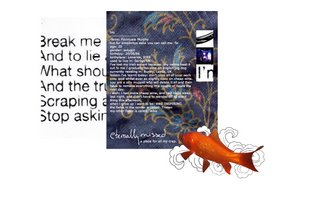
index (FISHIE!!)

music (needs more work methinks)

photography (oooh.. pink)
i'm pretty happy with the design, i got to develop on my existing skills and learnt how to tidy my code up abit. I went for quite an image heavy design, aiming at people with broadband connections and nice wide screens. i tested it out on my imac at home as well which has a smaller screen than these lovely G5s and there weren't any problems, i didn't have to do much extra scrolling as i tried to keep my design quite centered and screensize-ish, using the overflow tag on any layers with lots of information in them. I think that if you don't have broadband in this day and age you're being a bit silly, and don't deserve to see all the lovely photos and graphics i put so much effort into without a wait.
i would to do a bit more work on the music page, there isn't much content there really, i would like to add a little flash music player or something, or maybe video.
DAMN YOU GODADDY! YOU ARE POO.
anyway, since i managed to figure out how to setup ftp, only to see something that burned my retinas, for now all you're going to be seeing of my lovely website (it really is lovely) are these screen grabs. sorry.

index (FISHIE!!)

music (needs more work methinks)

photography (oooh.. pink)
i'm pretty happy with the design, i got to develop on my existing skills and learnt how to tidy my code up abit. I went for quite an image heavy design, aiming at people with broadband connections and nice wide screens. i tested it out on my imac at home as well which has a smaller screen than these lovely G5s and there weren't any problems, i didn't have to do much extra scrolling as i tried to keep my design quite centered and screensize-ish, using the overflow tag on any layers with lots of information in them. I think that if you don't have broadband in this day and age you're being a bit silly, and don't deserve to see all the lovely photos and graphics i put so much effort into without a wait.
i would to do a bit more work on the music page, there isn't much content there really, i would like to add a little flash music player or something, or maybe video.
14.11.06
Subscribe to:
Comments (Atom)


