I'm really happy with my montage, i've been waiting for an oppotunity to do something more illustration based as i always ended up in the darkroom on my last course, this time i got to experiment with hand drawn elements which have always interested me, and i experimented with layouts.
The original idea was to have everything coming out of the camera lens, to show how i sometimes see possible photographs everywhere, and how photography has affected my perception of the world, which in the illustration is made up of my possessions and pretty patterns! I used the photograph of the front of the camera in the montage as the photograph was a higher quality image and it makes the camera instantly recognizable. I converted the photograph of the camera to grey scale as the original photograph was a bit orange, and the camera becomes part of the image and patterns.
I originally wanted to use a gradient effect, with the patterns becoming darker the further away they were from the camera lens, but ended up just having a flat pattern instead. I liked how the image looked before i attempted any gradient effects, so decided to leave the image as it was, as i didn't want to do too much with an already busy image.
Alot of the feedback talks about the simplicity of the image, which i think is in the colours and the feel of the hand drawn elements. The layout is effective and the artwork is "unique". They've also said that the colour scheme makes the viewer focus on the only colourful element, the duck!
I'm pretty happy with the final image, i think i could have included more or possibly different personal items which said more about myself, but i like the effect generated by elements i've included. Basically that i really like photography and pretty patterns and random images stuck on my walls and silly things like ducks.
29.10.06
16.10.06
progress today... - comm design
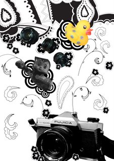
montage!!!
combination of hand drawn elements traced in illustrator and photographs. arranged in photoshop because i just feel more comfortable using it at the moment, and i don't want to waste time trying to figure out how to do simple things in illustrator when i know i can do it quickly in photoshop. i am getting used to illustrator though.
Thinking of doing some colour versions, i want to try using gradients and i want to see the effect different colours has on the image.
i think my hand is about to fall off.
13.10.06
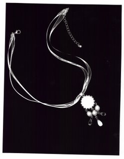
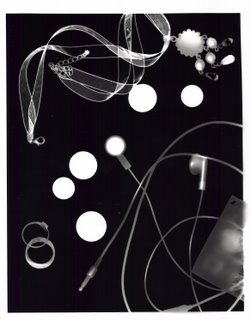
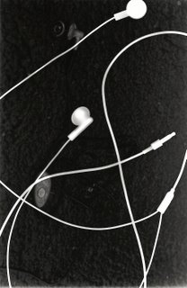
photograms
12.10.06
final layout idea - comm design
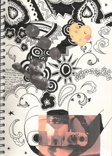
this is my final layout idea for the first brief. I think it looks a bit cluttered at the moment, too many ideas, but i think once it's blown up to A3 size it'll look better. I've decided to use a combination of the patterns from my scarves and candle holders to add some hand drawn elements to the image. i could scan in my scarves, but i like how the patterns look hand drawn, i think it also makes it more personal. so far i've included photos of my camera, lenses, techno duck and a photocopy from one of the posters i have on my wall.
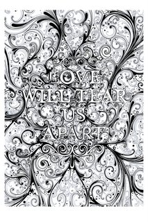
i think the layout has been influenced by some of si scotts work that has also made it's way onto my wall. especially this image:
I'm thinking of using colour in this image, well adding more than what's in the photographs anyway. i want to make the background patterns textured by crumpling up photocopies, but some elements, some of the flowers and swirls, will be made in illustrator.
i want the background pattern to be distressed, possibly using a gradient as well, and i'm thinking of using muted colours, maybe greens or browns. I'm not sure so i may just end up leaving the patterns in black, as it creates a striking image.
i want the image to show a range of my interests, from the silly things like ducks to my more serious love of photography. i want to include text in the background layers of the image, nothing too striking but i think this could be a way of including my interests of reading and music.
i think this image only needs developing a little bit more, there are some bits of the patterns i might like to change, and if possible i would like to include more photographs of my personal items.
cameras and ducks and pretty patterns - comm design

i first did some terrible doodles in my sketchbook, to make it feel like i was doing some work and try to think of elements i wanted to include in my montage. i also made a to do list. i discovered i was terrible at drawing ducks even though i love them, and i like the patterns on my candle holders and pretty stars.
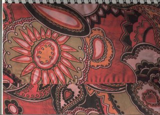
i decided i needed more to work with, i had only really taken photos of a few things which wasn't enough to make a whole montage. i also needed to bring in some illustration elements into the piece, and i think looking at patterns is a good way to develop ideas for layouts through looking at how all the elements come together. I decided to use the patterns on some of the scarves i like to wear as belts. i chose these two because of the bright colours and bold patterns.

drawn just with a gel pen. which died. i really like the patterns in this drawing, and it's interesting to see how the patterns look as a two tone flat image. Could use live trace in illustrator to keep the flatness, or do some experimentation with photocopying and photoshop to create texture.

another scarf! (i'm wearing this one today.. arfarfarf.) i like how the thiness of the fabric has created an effect like messing around with opacity levels in photoshop. i also like the patterns and colours.

i lost the opacity effect when i drew this as a flat 2d image as i didn't want to over complicate it, i wanted to keep simple forms. I think some of the elements in this image could easily be reproduced in illustrator as part of my final montage, such as the petal patterns, or i could be lazy and use live trace.

this is my first layout idea, combining lots of different elements into one image, the main focus being on the little army of terribly drawn techno ducks, and the camera (that drawing was so bad i had to cover it up with a photo!) the circles would be the illustrator elements, and possibly the patterns aswell but i like how they look hand drawn.

I wanted to make it look a bit textured, so i tried screwing up a photocopy of one of my pattern drawings to create a background that wasn't flat. i then added some of the elements i want to include in my montage, and then ran out of ideas and didn't know what else to do with it.

So i tried photocopying one of the photocopies i had screwed up, which creates an image with interesting texture that i think could be used in a layer in photoshop to make the image seem less flat.
photos for montage, maybe? - comm design
I still wasn't sure what i wanted to do, but i always feel much better when i've got a camera in my hand and have taken lots of photos, so this is what i did. the light in my room is terrible, so the photos aren't great and i sometimes tried using the flash which always comes out a bit crap. i took photos of some of the interesting things in my room, postcards and posters and the random useless things i tend to get attached to.

the now infamous techno duck. I love this duck a bit too much, but i don't care if it's wrong, he's amazing.
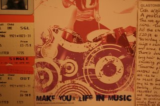
i stick postcards and other random images on my walls to hide the terrible paintwork and inspire me, or something. i really like the circles in this image, and the deteriorated effect.

i love these candle holders, i stare at them alot. i love the patterns on them, they're cheap japanese ripp offs i bought from internationale for £3. bargain. this photo also features little chicky, a little glass chicken a friend brought me from prague.

my sisters buy me cute teddies for my birthdays. aw.
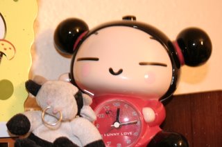
my broken pucca alarm clock, she's been a bit abused by morning me and now refuses to beep. there's also moo moo (the cow)
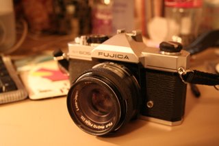
this is my pride and joy. vintage screw fit, falling apart and a little bit manky fujica SLR who's been on many an adventure with me. Since i love it and photography so much i definately want to use him in my montage.

so i took lots of photos of him.
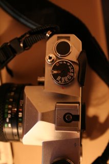
i'm interested in the dials and buttons. i like the idea of measurements and things.

the now infamous techno duck. I love this duck a bit too much, but i don't care if it's wrong, he's amazing.

i stick postcards and other random images on my walls to hide the terrible paintwork and inspire me, or something. i really like the circles in this image, and the deteriorated effect.

i love these candle holders, i stare at them alot. i love the patterns on them, they're cheap japanese ripp offs i bought from internationale for £3. bargain. this photo also features little chicky, a little glass chicken a friend brought me from prague.

my sisters buy me cute teddies for my birthdays. aw.

my broken pucca alarm clock, she's been a bit abused by morning me and now refuses to beep. there's also moo moo (the cow)

this is my pride and joy. vintage screw fit, falling apart and a little bit manky fujica SLR who's been on many an adventure with me. Since i love it and photography so much i definately want to use him in my montage.

so i took lots of photos of him.

i'm interested in the dials and buttons. i like the idea of measurements and things.
7.10.06
my old addiction to computer arts pays off - comm web + print
(terrible scans incl.)
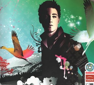 After thinking about the brief for a while i first thought of creating something along the lines of this. This image was produced in illustrator by Johnny Cheuk for a computer arts cover (Aug 2005), who's feature tutorial was how to use gradients in illustrator to add depth to 2d images, something Cheuk does all the time apparently. "I like to add gradients to my work. After all, gradation means variegation. I also like the effect of ink splashing and use arbitrary line drawings to humanize my illustrations and make up for the cold perfection" - (Johnny Cheuk, Computer arts, Aug 2005) I like his use of layers in this illustration to create texture, as vector images can sometimes seem flat, his use of colour and paint splashes adds life to the image.
 Another image by Johnny Cheuk, from the same issue of computer arts. I've decided to include this image aswell as the compostion of the montage is different from what i usually see. Most illustrations use compostions based on the rules from painting and photography (portrait, landscape etc) where this image is based around a cross. The elements of the image (cds, pens, paint) are used to make up another form. I also like the symmetry in the image.
 This image also featured in the same issue of computer arts is by GR/DD, a london based "graphic and interactive design consultancy". The image was designed for an article about design for mobiles, which is relfected in the imagery. I like the use of colour in the imagery, and even though it's textured it seems flatter than Johnny Cheuk's images, even though i think this image was made in photoshop (it seems pixelated in places and i think filters may have been used on some of the layers). I think some of the images may have been photocopied and then scanned in to create a deterioated effect, which is something i like doing and may do for this piece.
 Full image by GR/DD for computer arts Aug 2005
 After thinking about the brief for a while i first thought of creating something along the lines of this. This image was produced in illustrator by Johnny Cheuk for a computer arts cover (Aug 2005), who's feature tutorial was how to use gradients in illustrator to add depth to 2d images, something Cheuk does all the time apparently. "I like to add gradients to my work. After all, gradation means variegation. I also like the effect of ink splashing and use arbitrary line drawings to humanize my illustrations and make up for the cold perfection" - (Johnny Cheuk, Computer arts, Aug 2005) I like his use of layers in this illustration to create texture, as vector images can sometimes seem flat, his use of colour and paint splashes adds life to the image.
 Another image by Johnny Cheuk, from the same issue of computer arts. I've decided to include this image aswell as the compostion of the montage is different from what i usually see. Most illustrations use compostions based on the rules from painting and photography (portrait, landscape etc) where this image is based around a cross. The elements of the image (cds, pens, paint) are used to make up another form. I also like the symmetry in the image.
 This image also featured in the same issue of computer arts is by GR/DD, a london based "graphic and interactive design consultancy". The image was designed for an article about design for mobiles, which is relfected in the imagery. I like the use of colour in the imagery, and even though it's textured it seems flatter than Johnny Cheuk's images, even though i think this image was made in photoshop (it seems pixelated in places and i think filters may have been used on some of the layers). I think some of the images may have been photocopied and then scanned in to create a deterioated effect, which is something i like doing and may do for this piece.
 Full image by GR/DD for computer arts Aug 2005
5.10.06
crystal palace - critical studies

Hunter and Sands stereo camera, around 1880.
The stereo camera above was used to create stereo-daguerreotypes, which when viewed through a viewer, would create a 3d illusion. The dauguerrotype was an early photographic process which created an unique image which could not be reproduced, either positive or negative image depending on how light hit the sensitised surface.
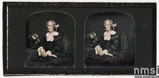
Hand coloured stereo-daguerreotype, John Jabez Edwin Mayall (1813-1901)
3.10.06
i love alexander rutterford - animation
just look at it with your eyes.
saw the last ten seconds on 120 minutes on mtv2 ages ago, forgot who did it, then much to my joy found the stills in my lovely copy of motion blur by onedotzero. I love the animation, it's absolutely amazing! i can't really imagine how it was done, definately includes 3d modeling. i think i read in the interview with alexander rutterford that each frame was rendered individualy.
a big mutating abstract thing in the middle of nothingness in perfect time to music. phwaor.
i also like another film by him, a personal project called 3space, which i'll discuss here later on, once i can find some stills / video to refer to.
He also did a video for radiohead, "go to sleep" which also contains some amazing 3d modeling and animation.
This one contains more of a narrative as it's less abstract then the Autechre video, it contains recognizable elements such as people and buildings, but still retains that weird abstract 3d edge. the people don't seem human and the buildings crumble and come back together again, something they don't really do in reality.
Although i love both of the videos i've discussed, i prefer the video for autechre. i'm amazed by the graphics, and how it's synchronized so well with the music. i really can't imagine how it was done, probably because i have no clue about 3d modeling yet, but if i could do anything even slightly like it, i'd be very, very happy.
2.10.06
critical studies image analysis exercise
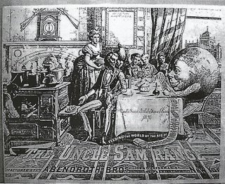
The uncle Sam Range (1876) Advertising image by Schumacher & Ettlinger, New York
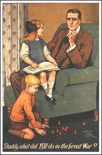
Poster by Savile Lumley (1915)
The target audience of the advertisement for the Uncle Sam Range was probably middle class American homeowners. It is shown as a wholesome American product, and the image is full of references to American ideals. The characters are labeled as being from different areas, “west” and “England”. The image literally shows the world sitting down to dinner, a message reinforced by the slogan “Feeding the world by the aid of the uncle sam range”. The world is holding what appears to be a shopping list for the world, illustrating all the different foods which can be cooked in the range, and appealing to the cultural diversity of the American culture. Text is used throughout the image to aid description, and help portray the message in the image. The main text is placed at the bottom of the image, inline with the perspective of the floor, causing it to become part of the image. My only reference is a black and white image, so it is possible that the text is more visible in the original colour version.
The second image by Savile Lumley is targeted at prospective army volunteers, designed to play on the insecurities of men with families reluctant to go to war. The image is intended to persuade the men to volunteer, as army recruits were no longer drafted during the time of the first world war. The image portrays a possible future event, which could also be directed at men who currently do not have families. It seems that the man had not participated in the war, and is asked by his children what he did to help the country. The image shows two children, the daughter sitting on her fathers lap pointing at what could possibly be a history book, detailing the war. The son is playing on the floor at his fathers feet with toy soldiers, showing possible admiration of soldiers. The image creates fear in the father or possible future father of losing the respect of his children as he had not participated in the war. Text is again placed at the bottom of the image, letting the image be the focal point of the poster and allowing it to clearly convey it’s message. The word “YOU” is underlined and in print to make it stand out from the rest of the text, and placing the viewer inside the situation depicted.
The two images use similar styles of illustration, and both depict the family in their homes, but convey very different messages. The advert for the Uncle Sam Range is attempting to create a warm atmosphere and a world where the American ideals of diversity and equality are maintained by the product. The Savile Lumley poster on the other hand is attempting to appeal to the insecurities of men who were not ‘fighting for their country’.
AMAZING
Subscribe to:
Comments (Atom)


